简单控件
App开发常见的几类简单控件的用法,主要包括:显示文字的文本视图、容纳视图的常用布 局、响应点击的按钮控件、显示图片的图像视图等。然后结合本章所学的知识,演示了一个实战项目“简 单计算器”的设计与实现。
文本显示
在文本视图TextView上显示规定的文本,包括:怎样在XML文件和Java代码中设置文本 内容,尺寸的大小有哪些单位、又该怎样设置文本的大小,颜色的色值是如何表达的、又该怎样设置文 本的颜色。
1、设置文本的内容
使用Java代码书写程序逻辑”小节,给出了设置文本内容的两种方式,一种是在XML 文件中通过属性android:text设置文本,比如下面这样:
<TextView
     android:id="@+id/tv_hello"
     android:layout_width="wrap_content"
     android:layout_height="wrap_content"
android:text="你好,世界" />另一种是在Java代码中调用文本视图对象的setText方法设置文本,比如下面这样:
// 获取名为tv_hello的文本视图
TextView tv_hello = findViewById(R.id.tv_hello);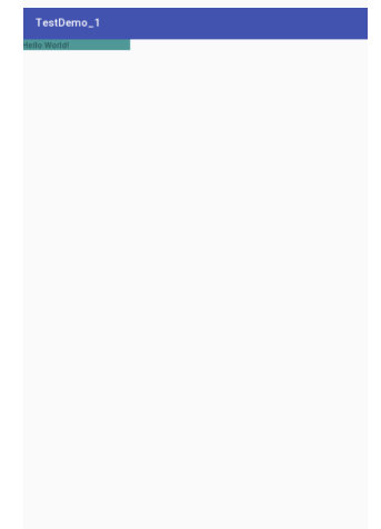
tv_hello.setText("你好,世界"); // 设置tv_hello的文字内容在XML文件中设置文本的话,把鼠标移到“你好,世界”上方时,Android Studio会弹出如图3-1所示的提示框。
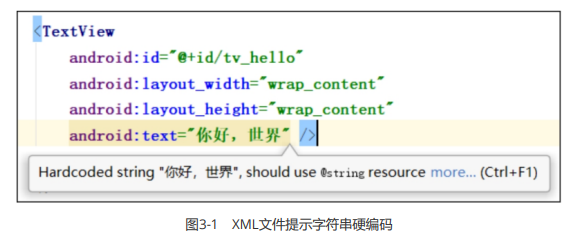
看到提示内容为“Hardcoded string "你好,世界", should use @string resouce”,意思说这几个字是硬 编码的字符串,建议使用来自@string的资源。原来Android Studio不推荐在XML布局文件里直接写字符 串,因为可能有好几个页面都显示“你好,世界”,若想把这句话换成“你吃饭了吗?”,就得一个一个XML 文件改过去,无疑费时费力。故而Android Studio推荐把字符串放到专门的地方管理,这个名为@string 的地方位于res/values目录下的strings.xml,打开该文件发现它的初始内容如下所示:
<resources>
	<string name="app_name">chapter03</string>
</resources>看来strings.xml定义了一个名为“app_name”的字符串常量,其值为“chapter03”。那么在此添加新的字 符串定义,字符串名为“hello”,字符串值为“你好,世界”,添加之后的strings.xml内容如下所示:
<resources>
     <string name="app_name">chapter03</string>
     <string name="hello">你好,世界</string>
</resources>添加完新的字符串定义,回到XML布局文件,将android:text属性值改为“@string/字符串名”这般,也就 是“@string/hello”,修改之后的TextView标签示例如下:
<TextView
     android:id="@+id/tv_hello"
     android:layout_width="wrap_content"
     android:layout_height="wrap_content"
android:text="@string/hello" />然后把鼠标移到“你好,世界”上方,此时Android Studio不再弹出任何提示了。 若要在Java代码中引用字符串资源,则调用setText方法时填写形如“R.string.字符串名”的参数,就本例 而言填入“R.string.hello”,修改之后的Java代码示例如下:
// 获取名为tv_hello的文本视图
TextView tv_hello = findViewById(R.id.tv_hello);
tv_hello.setText(R.string.hello); // 设置tv_hello的文字内容至此不管XML文件还是Java代码都从strings.xml引用字符串资源,以后想把“你好,世界”改为其他文字 的话,只需改动strings.xml一个地方即可。
2、设置文本的大小
TextView允许设置文本内容,也允许设置文本大小,在Java代码中调用setTextSize方法,即可指定文本 大小,就像以下代码这样:
// 从布局文件中获取名叫tv_sp的文本视图
TextView tv_sp = findViewById(R.id.tv_sp);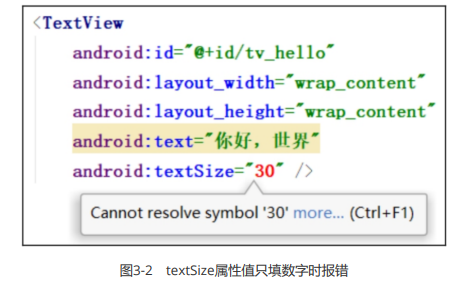
tv_sp.setTextSize(30); // 设置tv_sp的文本大小这里的大小数值越大,则看到的文本也越大;大小数值越小,则看到的文本也越小。在XML文件中则通 过属性android:textSize指定文本大小,可是如果给TextView标签添加“android:textSize="30"”,数字马 上变成红色如图3-2所示,鼠标移过去还会提示错误“Cannot resolve symbol '30'”,意思是无法解析“30” 这个符号。
原来文本大小存在不同的字号单位,XML文件要求在字号数字后面写明单位类型,常见的字号单位主要 有px、dp、sp 3种,分别介绍如下。
1.px
px是手机屏幕的最小显示单位,它与设备的显示屏有关。一般来说,同样尺寸的屏幕(比如6英寸手 机),如果看起来越清晰,则表示像素密度越高,以px计量的分辨率也越大。
2.dp
dp有时也写作dip,指的是与设备无关的显示单位,它只与屏幕的尺寸有关。一般来说,同样尺寸的屏 幕以dp计量的分辨率是相同的,比如同样是6英寸手机,无论它由哪个厂家生产,其分辨率换算成dp单 位都是一个大小。
3.sp
sp的原理跟dp差不多,但它专门用来设置字体大小。手机在系统设置里可以调整字体的大小(小、标 准、大、超大)。设置普通字体时,同数值dp和sp的文字看起来一样大;如果设置为大字体,用dp设置 的文字没有变化,用sp设置的文字就变大了。
字体大小采用不同单位的话,显示的文字大小各不相同。例如,30px、30dp、30sp这3个字号,在不同 手机上的显示大小有所差异。有的手机像素密度较低,一个dp相当于两个px,此时30px等同于15dp; 有的手机像素密度较高,一个dp相当于3个px,此时30px等同于10dp。假设某个App的内部文本使用字 号30px,则该App安装到前一部手机的字体大小为15dp,安装到后一部手机的字体大小为10dp,显然 后一部手机显示的文本会更小。
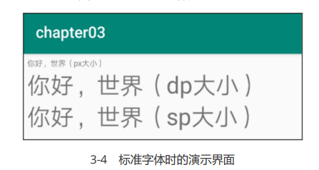
至于dp与sp之间的区别,可通过以下实验加以观察。首先创建测试活动页面,该页面的XML文件分别声 明30px、30dp、30sp这3个字号的TextView控件,布局内容如下所示:
<LinearLayout xmlns:android="http://schemas.android.com/apk/res/android"
     android:layout_width="match_parent"
     android:layout_height="match_parent"
     android:padding="5dp"
     android:orientation="vertical">

          <TextView
               android:id="@+id/tv_px"
               android:layout_width="wrap_content"
               android:layout_height="wrap_content"
               android:text="你好,世界(px大小)"
               android:textSize="30px" />

          <TextView
               android:id="@+id/tv_dp"
               android:layout_width="wrap_content"
               android:layout_height="wrap_content"
               android:text="你好,世界(dp大小)"
               android:textSize="30dp" />

          <TextView
               android:id="@+id/tv_sp"
               android:layout_width="wrap_content"
               android:layout_height="wrap_content"
               android:text="你好,世界(sp大小)"
               android:textSize="30sp" />
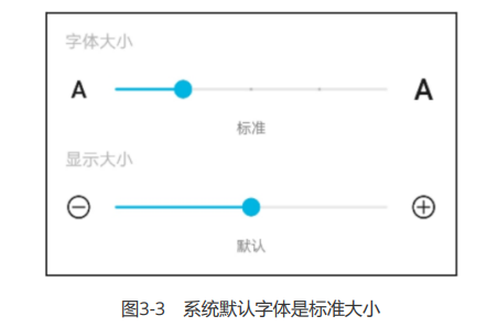
</LinearLayout>接着打开手机的设置菜单,依次选择“显示”→“字体与显示大小”,确认当前的字体为标准大小,如图3-3 所示。然后在手机上运行测试App,进入测试页面看到的文字效果如图3-4所示。
回到设置菜单的字体页面,将字体大小调整为大号,如图3-5所示。再次进入测试页面看到的文字效果如 图3-6所示。
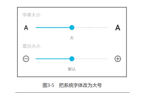
对照图3-4和图3-6,发现字号单位30px和30dp的文字大小不变,而30sp的文字随着系统字体一起变大了。
既然XML文件要求android:textSize必须指定字号单位,为什么Java代码调用setTextSize只填数字不填 单位呢?其实查看SDK源码,找到setTextSize方法的实现代码如下所示:
public void setTextSize(float size) {
	setTextSize(TypedValue.COMPLEX_UNIT_SP, size);
}原来纯数字的setTextSize方法,内部默认字号单位为sp(COMPLEX_UNIT_SP),这也从侧面印证了之 前的说法:sp才是Android推荐的字号单位。
补充
| 名称 | 解释 |
|---|---|
| px(Pixel像素) | 也称为图像元素,是作为图像构成的基本单元,单个像素的大小并不固定,跟随 屏幕大小和像素数量的关系变化,一个像素点为1px。 |
| Resolution (分辨率) | 是指屏幕的垂直和水平方向的像素数量,如果分辨率是 1920*1080 ,那就是垂 直方向有 1920 个像素,水平方向有 1080 个像素。 |
| Dpi(像素密度) | 是指屏幕上每英寸(1英寸 = 2.54 厘米)距离中有多少个像素点。 |
| Density(密度) | 是指屏幕上每平方英寸(2.54 ^ 2 平方厘米)中含有的像素点数量。 |
| Dip / dp (设备独立像素) | 也可以叫做dp,长度单位,同一个单位在不同的设备上有不同的显示效果,具体 效果根据设备的密度有关,详细的公式请看下面 。 |
计算规则
我们以一个 4.95 英寸 1920 * 1080 的 nexus5 手机设备为例:
Dpi
- 计算直角边像素数量: 1920^2+1080^2=2202^2(勾股定理)。
- 计算 DPI:2202 / 4.95 = 445。
- 得到这个设备的 DPI 为 445 (每英寸的距离中有 445 个像素)。
Density
所有显示到屏幕上的图像都是以 px 为单位,Dip 是我们开发中使用的长度单位,最后他也需要转换成 px,计算这个设备上 1dip 等于多少 px:
px = dip x dpi /160
根据换算关系:
320 x 480分辨率,3.6寸的手机:dpi为160,1dp=1px
实验一
相同分辨率,不同大小的手机AB:
| 代号 | 分辨率 | 尺寸 | dpi | dp |
|---|---|---|---|---|
| 手机A | 320x480 | 3.6寸 | 160 | 1dp=1px |
| 手机B | 320x480 | 7.2寸 | 80 | 1dp=0.5px |
假如AB都设置一个宽度为100dp的TextView:
| 代号 | TextView宽度 | 手机宽度 | 比例关系 |
|---|---|---|---|
| 手机A | 100px | 320px | 10/32 |
| 手机B | 50px | 320px | 5/32 |
得出结论:
对于相同分辨率的手机,屏幕越大,同DP的组件占用屏幕比例越小。
如图所示:
实验二
相同大小,不同分辨率的手机AB:
| 代号 | 分辨率 | 尺寸 | dpi | dip |
|---|---|---|---|---|
| 手机A | 320x480 | 3.6寸 | 160 | 1dp=1px |
| 手机B | 640x960 | 3.6寸 | 320 | 1dp=2px |
假如AB都设置一个宽度为100dp的TextView:
| 代号 | TextView宽度 | 手机宽度 | 比例关系 |
|---|---|---|---|
| 手机A | 100px | 320px | 10/32 |
| 手机B | 200px | 640px | 10/32 |
得出结论:
对于相同尺寸的手机,即使分辨率不同,同DP的组件占用屏幕比例也相同。
如图:
综上:
dp的UI效果只在相同尺寸的屏幕上相同,如果屏幕尺寸差异过大,则需要重做dp适配。
这也是平板需要单独做适配的原因,可见dp不是比例。
dp转px工具类
import android.content.Context;

public class Utils {

    //根据手机的分辨率从 dp 的单位,转成为 px(像素)
    public static int dip2px(Context context, float dpValue){
        //获取当前手机的像素密度(1个dp对应几个px)
        float scale = context.getResources().getDisplayMetrics().density;

        //四舍五入取整
        return (int)(dpValue * scale + 0.5f);
    }

}3、设置文本的颜色
除了设置文字大小,文字颜色也经常需要修改,毕竟Android默认的灰色文字不够醒目。在Java代码中调 用setTextColor方法即可设置文本颜色,具体在Color类中定义了12种颜色,详细的取值说明见表3-1。
表3-1 颜色类型的取值说明
| Color类中的颜色类型 | 说明 | Color类中的颜色类型 | 说明 |
|---|---|---|---|
| BLACK | 黑色 | GREEN | 绿色 |
| DKGRAY | 深灰 | BLUE | 蓝色 |
| GRAY | 灰色 | CYAN | 青色 |
| WHITE | 白色 | MAGENTA | 玫红 |
| REN | 红色 | TRANSPARENT | 透明 |
比如以下代码便将文本视图的文字颜色改成了绿色:
// 从布局文件中获取名为tv_code_system的文本视图
TextView tv_code_system = findViewById(R.id.tv_code_system);
// 将tv_code_system的文字颜色设置系统自带的绿色
tv_code_system.setTextColor(Color.GREEN);可是XML文件无法引用Color类的颜色常量,为此Android制定了一套规范的编码标准,将色值交由透明 度alpha和RGB三原色(红色red、绿色green、蓝色blue)联合定义。该标准又有八位十六进制数与六 位十六进制数两种表达方式,例如八位编码FFEEDDCC中,FF表示透明度,EE表示红色的浓度,DD表示 绿色的浓度,CC表示蓝色的浓度。透明度为FF表示完全不透明,为00表示完全透明。RGB三色的数值越 大,表示颜色越浓,也就越暗;数值越小,表示颜色越淡,也就越亮。RGB亮到极致就是白色,暗到极致就是黑色。
至于六位十六进制编码,则有两种情况,它在XML文件中默认不透明(等价于透明度为FF),而在代码 中默认透明(等价于透明度为00)。以下代码给两个文本视图分别设置六位色值与八位色值,注意添加 0x前缀表示十六进制数:
// 从布局文件中获取名为tv_code_six的文本视图
TextView tv_code_six = findViewById(R.id.tv_code_six);
// 将tv_code_six的文字颜色设置为透明的绿色,透明就是看不到
tv_code_six.setTextColor(0x00ff00);
// 从布局文件中获取名为tv_code_eight的文本视图
TextView tv_code_eight = findViewById(R.id.tv_code_eight);
// 将tv_code_eight的文字颜色设置为不透明的绿色,即正常的绿色
tv_code_eight.setTextColor(0xff00ff00);运行测试App,发现tv_code_six控件的文本不见了(其实是变透明了),而tv_code_eight控件的文本显 示正常的绿色。
在XML文件中可通过属性android:textColor设置文字颜色,但要给色值添加井号前缀“#”,设定好文本颜 色的TextView标签示例如下:
<TextView
     android:id="@+id/tv_xml"
     android:layout_width="wrap_content"
     android:layout_height="wrap_content"
     android:text="布局文件设置六位文字颜色"
     android:textColor="#00ff00"
android:textSize="17sp" />就像字符串资源那样,Android把颜色也当作一种资源,打开res/values目录下的colors.xml,发现里面 已经定义了3种颜色:
<resources>
     <color name="colorPrimary">#008577</color>
     <color name="colorPrimaryDark">#00574B</color>
     <color name="colorAccent">#D81B60</color>
</resources>那么先在resources节点内部补充如下的绿色常量定义:
<color name="green">#00ff00</color>然后回到XML布局文件,把android:textColor的属性值改为“@color/颜色名称”,也就是 android:textColor="@color/green",修改之后的标签TextView如下所示:
<TextView
     android:id="@+id/tv_values"
     android:layout_width="wrap_content"
     android:layout_height="wrap_content"
     android:text="资源文件引用六位文字颜色"
     android:textColor="@color/green"
android:textSize="17sp" />不仅文字颜色,还有背景颜色也会用到上述的色值定义,在XML文件中通过属性android:background设 置控件的背景颜色。Java代码则有两种方式设置背景颜色,倘若色值来源于Color类或十六进制数,则调 用setBackgroundColor方法设置背景;倘若色值来源于colors.xml中的颜色资源,则调用 setBackgroundResource方法,以“R.color.颜色名称”的格式设置背景。下面是两种方式的背景设定代码例子:
// 从布局文件中获取名叫tv_code_background的文本视图
TextView tv_code_background = findViewById(R.id.tv_code_background);
// 将tv_code_background的背景颜色设置为绿色
tv_code_background.setBackgroundColor(Color.GREEN); // 在代码中定义的色值
tv_code_background.setBackgroundResource(R.color.green); // 颜色来源于资源文件注意属性android:background和setBackgroundResource方法,它俩用来设置控件的背景,不单单是 背景颜色,还包括背景图片。在设置背景图片之前,先将图片文件放到res/drawable***目录(以 drawable开头的目录,不仅仅是drawable目录),然后把android:background的属性值改为 “@drawable/不含扩展名的图片名称”,或者调用setBackgroundResource方法填入“R.drawable.不含扩展名的图片名称”。
视图基础
视图的几种基本概念及其用法,包括如何设置视图的宽度和高度,如何设置视图的外部间距和 内部间距,如何设置视图的外部对齐方式和内部对齐方式,等等。
设置视图的宽高
手机屏幕是块长方形区域,较短的那条边叫作宽,较长的那条边叫作高。App控件通常也是长方形状, 控件宽度通过属性android:layout_width表达,控件高度通过属性android:layout_height表达,宽高的 取值主要有下列3种:
- match_parent:表示与上级视图保持一致。上级视图的尺寸有多大,当前视图的尺寸就有多大。
- wrap_content:表示与内容自适应。对于文本视图来说,内部文字需要多大的显示空间,当前视 图就要占据多大的尺寸。但最宽不能超过上级视图的宽度,一旦超过就要换行;最高不能超过上级视图 的高度,一旦超过就会隐藏。
- 以dp为单位的具体尺寸,比如300dp,表示宽度或者高度就是这么大。
在XML文件中采用以上任一方式均可设置视图的宽高,但在Java代码中设置宽高就有点复杂了,首先确 保XML中的宽高属性值为wrap_content,这样才允许在代码中修改宽高。接着打开该页面对应的Java代 码,依序执行以下3个步骤:
步骤一,调用控件对象的getLayoutParams方法,获取该控件的布局参数,参数类型为 ViewGroup.LayoutParams。
步骤二,布局参数的width属性表示宽度,height属性表示高度,修改这两个属性值,即可调整控件的宽 高。
步骤三,调用控件对象的setLayoutParams方法,填入修改后的布局参数使之生效。
不过布局参数的width和height两个数值默认是px单位,需要将dp单位的数值转换为px单位的数值,然 后才能赋值给width属性和height属性。下面是把dp大小转为px大小的方法代码:
// 根据手机的分辨率从 dp 的单位 转成为 px(像素)
public static int dip2px(Context context, float dpValue) {
     // 获取当前手机的像素密度(1个dp对应几个px)
     float scale = context.getResources().getDisplayMetrics().density;
     return (int) (dpValue * scale + 0.5f); // 四舍五入取整
}接下来通过演示页面并观察几种尺寸设置方式的界面效果,主要通过背景色区分当前视图的宽高范围, 详细的XML文件内容如下所示:
<LinearLayout xmlns:android="http://schemas.android.com/apk/res/android"
     android:layout_width="match_parent"
     android:layout_height="match_parent"
     android:orientation="vertical">

     <TextView
          android:layout_width="wrap_content"
          android:layout_height="wrap_content"
          android:layout_marginTop="5dp"
          android:background="#00ffff"
          android:text="视图宽度采用wrap_content定义"
          android:textColor="#000000"
          android:textSize="17sp" />

     <TextView
          android:layout_width="match_parent"
          android:layout_height="wrap_content"
          android:layout_marginTop="5dp"
          android:background="#00ffff"
          android:text="视图宽度采用match_parent定义"
          android:textColor="#000000"
          android:textSize="17sp" />

     <TextView
          android:layout_width="300dp"
          android:layout_height="wrap_content"
          android:layout_marginTop="5dp"
          android:background="#00ffff"
          android:text="视图宽度采用固定大小"
          android:textColor="#000000"
          android:textSize="17sp" />

     <TextView
          android:id="@+id/tv_code"
          android:layout_width="wrap_content"
          android:layout_height="wrap_content"
          android:layout_marginTop="5dp"
          android:background="#00ffff"
          android:text="通过代码指定视图宽度"
          android:textColor="#000000"
          android:textSize="17sp" />

</LinearLayout>运行测试App,打开演示界面如图3-7所示,依据背景色判断文本视图的边界,可见wrap_content方式 刚好包住了文本内容,match_parent方式扩展到了与屏幕等宽,而300dp的宽度介于前两者之间(安卓 手机的屏幕宽度基本为360dp)。
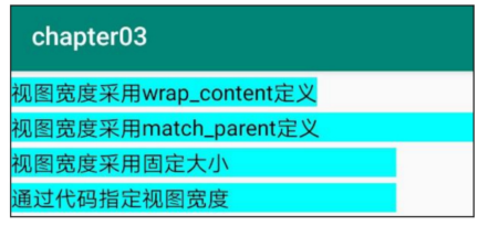
图3-7 设置控件宽度的几种方式效果
设置视图的间距
在上一小节末尾的XML文件中,每个TextView标签都携带新的属性 android:layout_marginTop="5dp",该属性的作用是让当前视图与上方间隔一段距离。同理, android:layout_marginLeft让当前视图与左边间隔一段距离,android:layout_marginRight让当前视图 与右边间隔一段距离,android:layout_marginBottom让当前视图与下方间隔一段距离。如果上下左右 都间隔同样的距离,还能使用android:layout_margin一次性设置四周的间距。
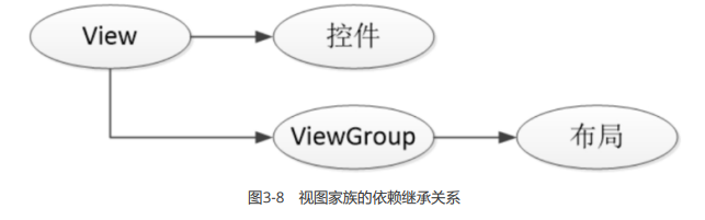
layout_margin不单单用于文本视图,还可用于所有视图,包括各类布局和各类控件。因为不管布局还 是控件,它们统统由视图基类View派生而来,而layout_margin正是View的一个通用属性,所以View的 子子孙孙都能使用layout_margin。在View的大家族中,视图组ViewGroup尤为特殊,它既是View的子 类,又是各类布局的基类。布局下面能容纳其他视图,而控件却不行,这正源自ViewGroup的组装特性。View、ViewGroup、控件、布局四者的继承关系如图3-8所示。
除了layout_margin之外,padding也是View的一个通用属性,它用来设置视图的内部间距,并且 padding也提供了paddingTop、paddingBottom、paddingLeft、paddingRight四个方向的距离属性。 同样是设置间距,layout_margin指的是当前视图与外部视图(包括上级视图和平级视图)之间的距 离,而padding指的是当前视图与内部视图(包括下级视图和内部文本)之间的距离。为了观察外部间 距和内部间距的差异,接下来做个实验,看看layout_margin与padding究竟有什么区别。
首先创建新的活动页面,并给该页面的XML文件填入以下的布局内容:
<!-- 最外层的布局背景为蓝色 -->
<LinearLayout xmlns:android="http://schemas.android.com/apk/res/android"
     android:layout_width="match_parent"
     android:layout_height="300dp"
     android:background="#00aaff"
     android:orientation="vertical">

     <!-- 中间层的布局背景为黄色 -->
     <LinearLayout
          android:layout_width="match_parent"
          android:layout_height="match_parent"
          android:layout_margin="20dp"
          android:background="#ffff99"
          android:padding="60dp">

     <!-- 最内层的视图背景为红色 -->
     <View
          android:layout_width="match_parent"
          android:layout_height="match_parent"
          android:background="#ff0000" />

	</LinearLayout>

</LinearLayout>上面的XML文件有两层视图嵌套,第一层是蓝色背景布局里面放黄色背景布局,第二层是黄色背景布局 里面放红色背景视图。中间层的黄色背景布局,同时设置了20dp的layout_margin,以及60dp的 padding,其中padding是layout_margin的三倍宽(60/20=3)。接着运行测试App,看到的演示界面 如图3-9所示。
从效果图可见,外面一圈间隔较窄,里面一圈间隔较宽,表示20dp的layout_margin位于外圈,而60dp 的padding位于内圈。这种情况印证了:layout_margin指的是当前图层与外部图层的距离,而padding 指的是当前图层与内部图层的距离。
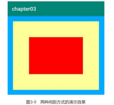
图3-9 两种间距方式的演示效果
设置视图的对齐方式
App界面上的视图排列,默认靠左朝上对齐,这也符合日常的书写格式。然而页面的排版不是一成不变 的,有时出于美观或者其他原因,要将视图排列改为朝下或靠右对齐,为此需要另外指定视图的对齐方 式。在XML文件中通过属性android:layout_gravity可以指定当前视图的对齐方向,当属性值为top时表 示视图朝上对齐,为bottom时表示视图朝下对齐,为left时表示视图靠左对齐,为right时表示视图靠右 对齐。如果希望视图既朝上又靠左,则用竖线连接top与left,此时属性标记为 android:layout_gravity="top|left";如果希望视图既朝下又靠右,则用竖线连接bottom与right,此时属性标记为android:layout_gravity="bottom|right"。
注意layout_gravity规定的对齐方式,指的是当前视图往上级视图的哪个方向对齐,并非当前视图的内部 对齐。若想设置内部视图的对齐方向,则需由当前视图的android:gravity指定,该属性一样拥有top、 bottom、left、right 4种取值及其组合。它与layout_gravity的不同之处在于:layout_gravity设定了当 前视图相对于上级视图的对齐方式,而gravity设定了下级视图相对于当前视图的对齐方式;前者决定了 当前视图的位置,而后者决定了下级视图的位置。
为了进一步分辨layout_gravity与gravity的区别,接下来做个实验,对某个布局视图同时设置 android:layout_gravity和android:gravity属性,再观察内外视图的对齐情况。下面便是实验用的XML文 件例子:
<?xml version="1.0" encoding="utf-8"?>
<LinearLayout xmlns:android="http://schemas.android.com/apk/res/android"
    android:layout_width="match_parent"
    android:layout_height="300dp"
    android:background="#FFFF00"
    android:orientation="horizontal">

    <!--
        layout_gravity:当前对齐方式
        gravity:子集对齐方式
    -->
    <LinearLayout
        android:layout_width="0dip"
        android:layout_weight="1"
        android:layout_height="200dp"
        android:layout_gravity="bottom"
        android:background="#00FFAA"
        android:layout_margin="10dp"
        android:padding="10dp"
        android:gravity="left">

        <View
            android:layout_width="100dp"
            android:layout_height="100dp"
            android:background="#000000">

        </View>
    </LinearLayout>

    <LinearLayout
        android:layout_width="0dip"
        android:layout_weight="1"
        android:layout_height="200dp"
        android:layout_gravity="top"
        android:background="#00FFAA"
        android:layout_margin="10dp"
        android:padding="10dp"
        android:gravity="right">

        <View
            android:layout_width="100dp"
            android:layout_height="100dp"
            android:background="#000000">

        </View>

    </LinearLayout>

</LinearLayout>运行测试App,打开演示界面如图3-10所示。
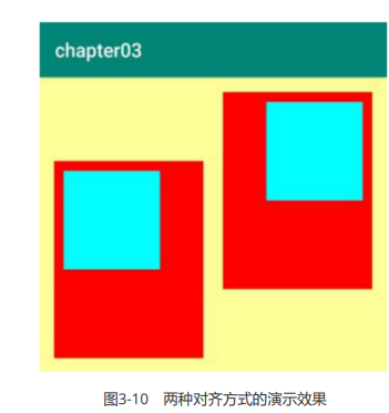
由效果图可见,第一个子布局朝下,并且它的内部视图靠左;而第二个子布局朝上,并且它的内部视图 靠右。对比XML文件中的layout_gravity和gravity取值,证明了二者的对齐情况正如之前所言: layout_gravity决定当前视图位于上级视图的哪个方位,而gravity决定了下级视图位于当前视图的哪个方 位。
常用布局
本节介绍常见的几种布局用法,包括在某个方向上顺序排列的线性布局,参照其他视图的位置相对排列 的相对布局,像表格那样分行分列显示的网格布局,以及支持通过滑动操作拉出更多内容的滚动视图。
Android各种布局的应用场景:
线性布局(LinearLayout):简单好用的布局方式;
相对布局(RelativeLayout):更加方便地设置各控件之间的相对位置、距离等;
帧布局(FrameLayout):当页面有耗时操作是,可以在外层加一个帧布局,来个加载中的显示, visibility属性为visible,然后当操作进行完成后,再将加载中显示页面visibility属性设置为 invisible 不可见 ;
表格布局(TableLayout):可占据多列,类似于计算器的场景;
绝对布局(AbsoluteLayout):用的很少,难以对不同屏幕大小的手机进行适配;
网格布局(GridLayout):相比于表格布局,既可占据多列,也可占据多行,类似于计算器的场景;
约束布局(ConstraintLayout):布局减少了嵌套,提高了界面的效率,比较推崇;
线性布局LinearLayout
顾名思义,指的是整个Android布局中的控件摆放方式是以线性的方式摆放的。
属性 android:orientation = “vertical” | “horizontal” 竖直或水平,默认水平
android:orientation控制方向,属性值垂直(vertical)和水平(horizontal),默认水平方向。 属性 android:gravity = “top”|"center”|“bottom” 相对于父容器的对齐方式
android:gravity:内部控件对齐方式,常用属性值有center、center_vertical、center_horizontal、top、bottom、left、right等。 这个属性在布局组件RelativeLayout、TableLayout中也有使用,FrameLayout、AbsoluteLayout则没有这个属性。 center:居中显示,这里并不是表示显示在LinearLayout的中心,当LinearLayout线性方向为垂直方向时,center表示水平居中,但是并不能垂直居中,此时等同于center_horizontal的作用;同样当线性方向为水平方向时,center表示垂直居中,等同于center_vertical。 top、bottom、left、right顾名思义为内部控件居顶、低、左、右布局。
线性布局中的 gravity 对齐方式表
XML文件用到了LinearLayout布局,它的学名为线性布局。顾名思义,线性布局像是用一根线把它的内部视图串起来,故而内部视图之间的排列顺序是固定的,要么从左到右排列,要 么从上到下排列。在XML文件中,LinearLayout通过属性android:orientation区分两种方向,其中从左到右排列叫作水平方向,属性值为horizontal;从上到下排列叫作垂直方向,属性值为vertical。如果 LinearLayout标签不指定具体方向,则系统默认该布局为水平方向排列,也就是默认 android:orientation="horizontal"。
下面做个实验,让XML文件的根节点挂着两个线性布局,第一个线性布局采取horizontal水平方向,第 二个线性布局采取vertical垂直方向。然后每个线性布局内部各有两个文本视图,通过观察这些文本视图 的排列情况,从而检验线性布局的显示效果。详细的XML文件内容如下所示:
<?xml version="1.0" encoding="utf-8"?>
<LinearLayout xmlns:android="http://schemas.android.com/apk/res/android"
    android:layout_width="match_parent"
    android:layout_height="match_parent"
    android:orientation="vertical"
    android:rotationX="2">

    <!--
        当 orientation 的属性值为 horizontal 为垂直布局(从左到右),改值也是默认值
        当 orientation 的属性值为 vertical 为水平布局(从上到下)
    -->
    <LinearLayout
          android:layout_width="match_parent"
          android:layout_height="wrap_content"
          android:orientation="horizontal">

          <TextView
               android:layout_width="wrap_content"
               android:layout_height="wrap_content"
               android:text="横排第一个"
               android:textSize="17sp"
               android:textColor="#000000" />

          <TextView
               android:layout_width="wrap_content"
               android:layout_height="wrap_content"
               android:text="横排第二个"
               android:textSize="17sp"
               android:textColor="#000000" />

     </LinearLayout>

     <LinearLayout
          android:layout_width="match_parent"
          android:layout_height="wrap_content"
          android:orientation="vertical">

          <TextView
               android:layout_width="wrap_content"
               android:layout_height="wrap_content"
               android:text="竖排第一个"
               android:textSize="17sp"
               android:textColor="#000000" />

          <TextView
               android:layout_width="wrap_content"
               android:layout_height="wrap_content"
               android:text="竖排第二个"
               android:textSize="17sp"
               android:textColor="#000000" />

	</LinearLayout>

</LinearLayout>运行测试App,进入如图3-11所示的演示页面,可见horizontal为横向排列,vertical为纵向排列,说明 android:orientation的方向属性确实奏效了。
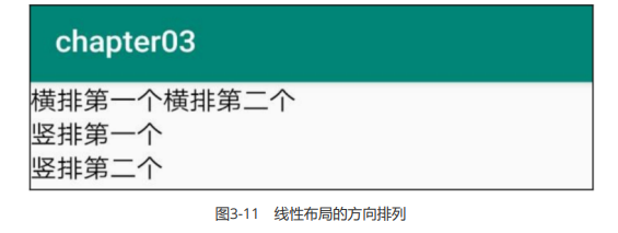
图3-11 线性布局的方向排列
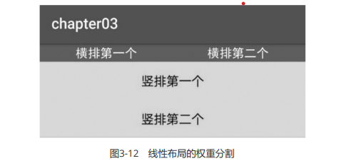
除了方向之外,线性布局还有一个权重概念,所谓权重,指的是线性布局的下级视图各自拥有多大比例 的宽高。比如一块蛋糕分给两个人吃,可能两人平均分,也可能甲分三分之一,乙分三分之二。两人平 均分的话,先把蛋糕切两半,然后甲分到一半,乙分到另一半,此时甲乙的权重比为1:1。甲分三分之 一、乙分三分之二的话,先把蛋糕平均切成三块,然后甲分到一块,乙分到两块,此时甲乙的权重比为 1:2。就线性布局而言,它自身的尺寸相当于一整块蛋糕,它的下级视图们一起来分这个尺寸蛋糕,有的 视图分得多,有的视图分得少。分多分少全凭每个视图分到了多大的权重,这个权重在XML文件中通过 属性android:layout_weight来表达。
把线性布局看作蛋糕的话,分蛋糕的甲乙两人就相当于线性布局的下级视图。假设线性布局平均分为左 右两块,则甲视图和乙视图的权重比为1:1,意味着两个下级视图的layout_weight属性都是1。不过视图 有宽高两个方向,系统怎知layout_weight表示哪个方向的权重呢?所以这里有个规定,一旦设置了 layout_weight属性值,便要求layout_width填0dp或者layout_height填0dp。如果layout_width填 0dp,则layout_weight表示水平方向的权重,下级视图会从左往右分割线性布局;如果layout_height填 0dp,则layout_weight表示垂直方向的权重,下级视图会从上往下分割线性布局。
按照左右均分的话,线性布局设置水平方向horizontal,且甲乙两视图的layout_width都填0dp, layout_weight都填1,此时横排的XML片段示例如下:
<LinearLayout
     android:layout_width="match_parent"
     android:layout_height="wrap_content"
     android:orientation="horizontal">

     <TextView
          android:layout_width="0dp"
          android:layout_height="wrap_content"
          android:layout_weight="1"
          android:text="横排第一个"
          android:textSize="17sp"
          android:textColor="#000000" />

     <TextView
          android:layout_width="0dp"
          android:layout_height="wrap_content"
          android:layout_weight="1"
          android:text="横排第二个"
          android:textSize="17sp"
          android:textColor="#000000" />

</LinearLayout>按照上下均分的话,线性布局设置垂直方向vertical,且甲乙两视图的layout_height都填0dp, layout_weight都填1,此时竖排的XML片段示例如下:
<LinearLayout
     android:layout_width="match_parent"
     android:layout_height="wrap_content"
     android:orientation="vertical">

     <TextView
          android:layout_width="wrap_content"
          android:layout_height="0dp"
          android:layout_weight="1"
          android:text="竖排第一个"
          android:textSize="17sp"
          android:textColor="#000000" />

     <TextView
          android:layout_width="wrap_content"
          android:layout_height="0dp"
          android:layout_weight="1"
          android:text="竖排第二个"
          android:textSize="17sp"
          android:textColor="#000000" />
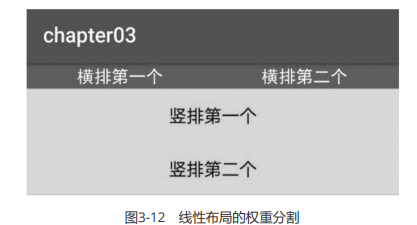
</LinearLayout>把上面两个片段放到新页面的XML文件,其中第一个是横排区域采用红色背景(色值为ff0000),第二 个是竖排区域采用青色背景(色值为00ffff)。重新运行测试App,打开演示界面如图3-12所示,可见横 排区域平均分为左右两块,竖排区域平均分为上下两块。
相对布局RelativeLayout
在相对布局中,可以方便地设置控件间的间距等。它在MarginLayout的基础上,添加了对齐方法——layout_alignBottom="@+id/iv"。对齐指的是和其他控件对齐。
线性布局的下级视图是顺序排列着的,另一种相对布局的下级视图位置则由其他视图决定。相对布局名 为RelativeLayout,因为下级视图的位置是相对位置,所以得有具体的参照物才能确定最终位置。如果 不设定下级视图的参照物,那么下级视图默认显示在RelativeLayout内部的左上角。
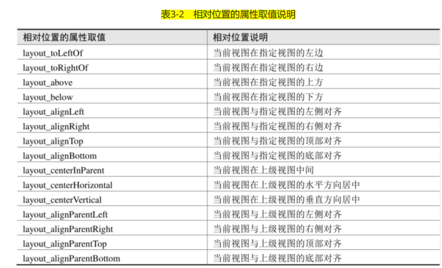
用于确定下级视图位置的参照物分两种,一种是与该视图自身平级的视图;另一种是该视图的上级视图 (也就是它归属的RelativeLayout)。综合两种参照物,相对位置在XML文件中的属性名称说明见表3- 2。
为了更好地理解上述相对属性的含义,接下来使用RelativeLayout及其下级视图进行布局来看看实际效 果图。下面是演示相对布局的XML文件例子:
<RelativeLayout xmlns:android="http://schemas.android.com/apk/res/android"
     android:layout_width="match_parent"
     android:layout_height="150dp" >

     <TextView
          android:id="@+id/tv_center"
          android:layout_width="wrap_content"
          android:layout_height="wrap_content"
          android:layout_centerInParent="true"
          android:background="#ffffff"
          android:text="我在中间"
          android:textSize="11sp"
          android:textColor="#000000" />

     <TextView
          android:id="@+id/tv_center_horizontal"
          android:layout_width="wrap_content"
          android:layout_height="wrap_content"
          android:layout_centerHorizontal="true"
          android:background="#eeeeee"
          android:text="我在水平中间"
          android:textSize="11sp"
          android:textColor="#000000" />

	<TextView
          android:id="@+id/tv_center_vertical"
          android:layout_width="wrap_content"
          android:layout_height="wrap_content"
          android:layout_centerVertical="true"
          android:background="#eeeeee"
          android:text="我在垂直中间"
          android:textSize="11sp"
          android:textColor="#000000" />

     <TextView
          android:id="@+id/tv_parent_left"
          android:layout_width="wrap_content"
          android:layout_height="wrap_content"
          android:layout_alignParentLeft="true"
          android:background="#eeeeee"
          android:text="我跟上级左边对齐"
          android:textSize="11sp"
          android:textColor="#000000" />

     <TextView
          android:id="@+id/tv_parent_right"
          android:layout_width="wrap_content"
          android:layout_height="wrap_content"
          android:layout_alignParentRight="true"
          android:background="#eeeeee"
          android:text="我跟上级右边对齐"
          android:textSize="11sp"
          android:textColor="#000000" />

     <TextView
          android:id="@+id/tv_parent_top"
          android:layout_width="wrap_content"
          android:layout_height="wrap_content"
          android:layout_alignParentTop="true"
          android:background="#eeeeee"
          android:text="我跟上级顶部对齐"
          android:textSize="11sp"
          android:textColor="#000000" />

     <TextView
          android:id="@+id/tv_parent_bottom"
          android:layout_width="wrap_content"
          android:layout_height="wrap_content"
          android:layout_alignParentBottom="true"
          android:background="#eeeeee"
          android:text="我跟上级底部对齐"
          android:textSize="11sp"
          android:textColor="#000000" />

     <TextView
          android:id="@+id/tv_left_center"
          android:layout_width="wrap_content"
          android:layout_height="wrap_content"
          android:layout_toLeftOf="@+id/tv_center"
          android:layout_alignTop="@+id/tv_center"
          android:background="#eeeeee"
          android:text="我在中间左边"
          android:textSize="11sp"
          android:textColor="#000000" />

	<TextView
          android:id="@+id/tv_right_center"
          android:layout_width="wrap_content"
          android:layout_height="wrap_content"
          android:layout_toRightOf="@+id/tv_center"
          android:layout_alignBottom="@+id/tv_center"
          android:background="#eeeeee"
          android:text="我在中间右边"
          android:textSize="11sp"
          android:textColor="#000000" />

     <TextView
          android:id="@+id/tv_above_center"
          android:layout_width="wrap_content"
          android:layout_height="wrap_content"
          android:layout_above="@+id/tv_center"
          android:layout_alignLeft="@+id/tv_center"
          android:background="#eeeeee"
          android:text="我在中间上面"
          android:textSize="11sp"
          android:textColor="#000000" />

     <TextView
          android:id="@+id/tv_below_center"
          android:layout_width="wrap_content"
          android:layout_height="wrap_content"
          android:layout_below="@+id/tv_center"
          android:layout_alignRight="@+id/tv_center"
          android:background="#eeeeee"
          android:text="我在中间下面"
          android:textSize="11sp"
          android:textColor="#000000" />
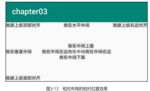
</RelativeLayout>上述XML文件的布局效果如图3-13所示,RelativeLayout的下级视图都是文本视图,控件上的文字说明 了所处的相对位置,具体的控件显示方位正如XML属性中描述的那样。
网格布局GridLayout
虽然线性布局既能在水平方向排列,也能在垂直方向排列,但它不支持多行多列的布局方式,只支持单 行(水平排列)或单列(垂直排列)的布局方式。若要实现类似表格那样的多行多列形式,可采用网格 布局GridLayout。
网格布局默认从左往右、从上到下排列,它先从第一行从左往右放置下级视图,塞满之后另起一行放置 其余的下级视图,如此循环往复直至所有下级视图都放置完毕。为了判断能够容纳几行几列,网格布局 新增了android:columnCount与android:rowCount两个属性,其中columnCount指定了网格的列数, 即每行能放多少个视图;rowCount指定了网格的行数,即每列能放多少个视图。
下面是运用网格布局的XML布局样例,它规定了一个两行两列的网格布局,且内部容纳四个文本视图。 XML文件内容如下所示:
<!-- 根布局为两行两列的网格布局,其中列数由columnCount指定,行数由rowCount指定 -->
<GridLayout xmlns:android="http://schemas.android.com/apk/res/android"
     android:layout_width="match_parent"
     android:layout_height="match_parent"
     android:columnCount="2"
     android:rowCount="2">

     <TextView
          android:layout_width="180dp"
          android:layout_height="60dp"
          android:gravity="center"
          android:background="#ffcccc"
          android:text="浅红色"
          android:textColor="#000000"
          android:textSize="17sp" />

     <TextView
          android:layout_width="180dp"
          android:layout_height="60dp"
          android:gravity="center"
          android:background="#ffaa00"
          android:text="橙色"
          android:textColor="#000000"
		android:textSize="17sp" />

     <TextView
          android:layout_width="180dp"
          android:layout_height="60dp"
          android:gravity="center"
          android:background="#00ff00"
          android:text="绿色"
          android:textColor="#000000"
          android:textSize="17sp" />

     <TextView
          android:layout_width="180dp"
          android:layout_height="60dp"
          android:gravity="center"
          android:background="#660066"
          android:text="深紫色"
          android:textColor="#000000"
          android:textSize="17sp" />

</GridLayout>在一个新建的活动页面加载上述布局,运行App观察到的界面如图3-14所示。
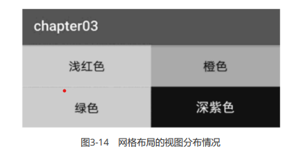
由图3-14可见,App界面的第一行分布着浅红色背景与橙色背景的文本视图,第二行分布着绿色背景与 深紫色背景的文本视图,说明利用网格布局实现了多行多列的效果。
框架布局/帧布局FrameLayout
据说这种布局方式在六大布局中最为简单,这个布局直接在屏幕上开辟出一块空白的区域,当我们往里面添加控件的时候,会默认把他们放到这块区域的左上角,而这种布局方式却没有任何的定位方式,所以它应用的场景并不多。
| 属性 | 作用 |
|---|---|
| android:foreground | 设置改帧布局容器的前景图像 |
| android:foregroundGravity | 设置前景图像显示的位置 |
<?xml version="1.0" encoding="utf-8"?>
<FrameLayout xmlns:android="http://schemas.android.com/apk/res/android"
    xmlns:app="http://schemas.android.com/apk/res-auto"
    xmlns:tools="http://schemas.android.com/tools"
    android:layout_width="match_parent"
    android:layout_height="match_parent"
    android:foreground="@drawable/test"
    android:foregroundGravity="right|bottom"
    tools:context=".MainActivity"
    // 前景图片android:foregroundGravity="right|bottom">

    <ImageView
        android:layout_width="300dp"
        android:layout_height="300dp"
        android:background="@color/colorPrimaryDark" />

    <ImageView
        android:layout_width="200dp"
        android:layout_height="200dp"
        android:background="@color/colorAccent" />

    <ImageView
        android:layout_width="100dp"
        android:layout_height="100dp"
        android:background="@color/colorPrimary" />

</FrameLayout>三个ImageView设置不同大小与背景色,依次覆盖,接着右下角的是前景图像,通过 android:foreground="@drawable/logo"设置前景图像的图片 android:foregroundGravity="right|bottom"设置前景图像的位置在右下角。
层布局主要应用就是地图方面。
上面有三层颜色,点击下面的案列上面会出现对应的样式
xml代码:
<LinearLayout xmlns:android="http://schemas.android.com/apk/res/android"
    xmlns:tools="http://schemas.android.com/tools"
    android:id="@+id/LinearLayout1"
    android:layout_width="match_parent"
    android:layout_height="match_parent"
    android:orientation="vertical">

    <FrameLayout
        android:id="@+id/frame"
        android:layout_width="match_parent"
        android:layout_height="wrap_content"
        android:layout_margin="20dp">

        <TextView
            android:id="@+id/text1"
            android:layout_width="match_parent"
            android:layout_height="300dp"
            android:background="#0000ff" />

        <TextView
            android:id="@+id/text2"
            android:layout_width="match_parent"
            android:layout_height="300dp"
            android:background="#00ff00" />

        <TextView
            android:id="@+id/text3"
            android:layout_width="match_parent"
            android:layout_height="300dp"
            android:background="#ff0000" />
    </FrameLayout>

    <LinearLayout
        android:id="@+id/linear"
        android:layout_width="match_parent"
        android:layout_height="wrap_content"
        android:orientation="horizontal">

        <Button
            android:id="@+id/button1"
            android:layout_width="wrap_content"
            android:layout_height="wrap_content"
            android:layout_marginLeft="20dp"
            android:layout_weight="1"
            android:background="#0000ff"
            android:text="颜色1" />

        <Button
            android:id="@+id/button2"
            android:layout_width="wrap_content"
            android:layout_height="wrap_content"
            android:layout_marginLeft="20dp"
            android:layout_marginRight="20dp"
            android:layout_weight="1"
            android:background="#00ff00"
            android:text="颜色2" />

        <Button
            android:id="@+id/button3"
            android:layout_width="wrap_content"
            android:layout_height="wrap_content"
            android:layout_marginRight="20dp"
            android:layout_weight="1"
            android:background="#ff0000"
            android:text="颜色3" />
    </LinearLayout>
</LinearLayout>java代码:
package com.example.chapter03;

import androidx.appcompat.app.AppCompatActivity;

import android.os.Bundle;
import android.view.View;
import android.widget.Button;
import android.widget.TextView;

public class FrameLayout extends AppCompatActivity {
    private android.widget.FrameLayout frame;
    private TextView text1;
    private TextView text2;
    private TextView text3;
    private Button button1;
    private Button button2;
    private Button button3;

    @Override
    protected void onCreate(Bundle savedInstanceState) {
        super.onCreate(savedInstanceState);
        setContentView(R.layout.activity_frame_layout);
        frame = (android.widget.FrameLayout) findViewById(R.id.frame);
        text1 = (TextView) findViewById(R.id.text1);
        text2 = (TextView) findViewById(R.id.text2);
        text3 = (TextView) findViewById(R.id.text3);
        button1 = (Button) findViewById(R.id.button1);
        button2 = (Button) findViewById(R.id.button2);
        button3 = (Button) findViewById(R.id.button3);
        button1.setOnClickListener(listener);
        button2.setOnClickListener(listener);button3.setOnClickListener(listener);
    }
    private View.OnClickListener listener = new View.OnClickListener() {
        @Override
        public void onClick(View v) {
            if (v.getId() == R.id.button1){
                frame.removeView(text1);//创建
                frame.addView(text1);
            }
            if (v.getId() == R.id.button2){
                frame.removeViewInLayout(text2);
                frame.addView(text2);
            }
            if (v.getId() == R.id.button3){
                frame.removeViewInLayout(text3);
                frame.addView(text3);
            }
        }
    };
}绝对布局AbsoluteLayout
绝对布局中将所有的子元素通过设置android:layout_x 和 android:layout_y属性,将子元素的坐标位置固定下来,即坐标(android:layout_x, android:layout_y) ,layout_x用来表示横坐标,layout_y用来表示纵坐标。屏幕左上角为坐标(0,0),横向往右为正方,纵向往下为正方。实际应用中,这种布局用的比较少,因为Android终端一般机型比较多,各自的屏幕大小。分辨率等可能都不一样,如果用绝对布局,可能导致在有的终端上显示不全等。所有基本不会使用,这里就不多介绍了。
表格布局TableLayout
表格布局与HTML中的table td tr标签类似
<table>
     <tr>
          <td></td>
     </tr>
</table>如何确定行与列
如果在TableLayout下添加组件,这个组件会占满整行
如果想把多个组件放在同一行,需要添加TableRow的容器,然后把组件放进去
TableRow中的组件个数决定的该行的列数,而列的宽度由列中最宽的单元格决定
TableRow嗯layout_width属性默认是fill-parent,修改无效。但是layout_height默认是wrapcontent,可以修改
整个表格的宽度取决于父容器的宽度(占满父容器)
重要的属性:
- android:collapaseColumns:设置需要被隐藏的列的序号
- android:shrinkColumns:设置允许被收缩的列的序号
- android:stretchCoumns:设置运行被拉伸嗯列的序号 这三个属性都是从0开始算的
shrinkColumns= "2" //对应第三行 shrinkColumns = '"0,2" //设置多个都生效 shrinkColumns = "" //所有列都生效- android:layout_column=“2”: 表示跳过第二个,直接显示第三个,从1开始
- android:layout_span=“4”:表示合并*4个单元格,也就说这个组件占4个单元格
表格布局,适用于多行多列的布局格式,每个TableLayout是由多个TableRow组成,一个TableRow就表示TableLayout中的每一行,这一行可以由多个子元素组成。实际上TableLayout和TableRow都是LineLayout线性布局的子类。但是TableRow的参数android:orientation属性值固定为horizontal,且android:layout_width=MATCH_PARENT,android:layout_height=WRAP_CONTENT。所以TableRow实际是一个横向的线性布局,且所以子元素宽度和高度一致。 注意:在TableLayout中,单元格可以为空,但是不能跨列,意思是只能不能有相邻的单元格为空。
TableLayout常用属性:
android:shrinkColumns:设置可收缩的列,内容过多就收缩显示到第二行
android:stretchColumns:设置可伸展的列,将空白区域填充满整个列
android:collapseColumns:设置要隐藏的列
列的索引从0开始,shrinkColumns和stretchColumns可以同时设置。
子控件常用属性:
- android:layout_column:第几列
- android:layout_span:占据列数
效果图是一个计数器页面:
<TableLayout xmlns:android="http://schemas.android.com/apk/res/android"
    android:id="@+id/TableLayout1"
    android:layout_width="match_parent"
    android:layout_height="match_parent"
    android:stretchColumns="*">

    <TextView
        android:id="@+id/text"
        android:layout_width="match_parent"
        android:layout_height="150dp"
        android:background="@android:color/holo_blue_bright"
        android:gravity="center|right"
        android:text=""
        android:textSize="30dp" />

    <TableRow
        android:layout_width="match_parent"
        android:layout_height="match_parent"
        android:layout_weight="1">

        <Button
            android:id="@+id/btn01"
            android:layout_width="wrap_content"
            android:layout_height="match_parent"
            android:text="C" />

        <Button
            android:id="@+id/btn02"
            android:layout_width="wrap_content"
            android:layout_height="match_parent"
            android:text="←" />

        <Button
            android:layout_width="wrap_content"
            android:layout_height="match_parent"
            android:text="%" />

        <Button
            android:layout_width="wrap_content"
            android:layout_height="match_parent"
            android:text="÷" />
    </TableRow>

    <TableRow
        android:layout_width="match_parent"
        android:layout_height="match_parent"
        android:layout_weight="1">

        <Button
            android:layout_width="wrap_content"
            android:layout_height="match_parent"
            android:text="7" />

        <Button
            android:layout_width="wrap_content"
            android:layout_height="match_parent"
            android:text="8" />

        <Button
            android:layout_width="wrap_content"
            android:layout_height="match_parent"
            android:text="9" />

        <Button
            android:layout_width="wrap_content"
            android:layout_height="match_parent"
            android:text="x" />
    </TableRow>

    <TableRow
        android:layout_width="match_parent"
        android:layout_height="match_parent"
        android:layout_weight="1">

        <Button
            android:layout_width="wrap_content"
            android:layout_height="match_parent"
            android:text="4" />

        <Button
            android:layout_width="wrap_content"
            android:layout_height="match_parent"
            android:text="5" />

        <Button
            android:layout_width="wrap_content"
            android:layout_height="match_parent"
            android:text="6" />

        <Button
            android:layout_width="wrap_content"
            android:layout_height="match_parent"
            android:text="-" />
    </TableRow>

    <TableRow
        android:layout_width="match_parent"
        android:layout_height="match_parent"
        android:layout_weight="1">

        <Button
            android:layout_width="wrap_content"
            android:layout_height="match_parent"
            android:text="1" />

        <Button
            android:layout_width="wrap_content"
            android:layout_height="match_parent"
            android:text="2" />

        <Button
            android:layout_width="wrap_content"
            android:layout_height="match_parent"
            android:text="3" />

        <Button
            android:layout_width="wrap_content"
            android:layout_height="match_parent"
            android:text="+" />
    </TableRow>

    <TableRow
        android:layout_width="match_parent"
        android:layout_height="match_parent"
        android:layout_weight="1">

        <Button
            android:layout_width="wrap_content"
            android:layout_height="match_parent"
            android:text="." />

        <Button
            android:layout_width="wrap_content"
            android:layout_height="match_parent"
            android:text="0" />

        <Button
            android:id="@+id/btn19"
            android:layout_width="wrap_content"
            android:layout_height="match_parent"
            android:layout_span="2"
            android:text="=" />
    </TableRow>
</TableLayout>约束布局ConstraintLayout
1. 简单介绍
布局减少了嵌套,可以使得界面的效率更高,故六大布局方法中,约束布局为人们所推崇。
下面是一些简单的属性:
<?xml version="1.0" encoding="utf-8"?>
<androidx.constraintlayout.widget.ConstraintLayout xmlns:android="http://schemas.android.com/apk/res/android"
    xmlns:app="http://schemas.android.com/apk/res-auto"
    xmlns:tools="http://schemas.android.com/tools"
    android:layout_width="match_parent"
    android:layout_height="match_parent"
    android:orientation="horizontal"
    android:weightSum="3"
    tools:context=".MainActivity">

    <View
        android:layout_width="match_parent"
        android:layout_height="0dp"
        android:layout_marginLeft="20dp"
        android:layout_marginTop="20dp"
        android:layout_marginRight="20dp"
        android:layout_marginBottom="20dp"
        android:background="#D81C60"
        app:layout_constraintBottom_toBottomOf="parent"
        app:layout_constraintHorizontal_weight="1"
        app:layout_constraintStart_toStartOf="parent"
        app:layout_constraintTop_toTopOf="parent" />

</androidx.constraintlayout.widget.ConstraintLayout>该例子中,控件四周边距都为20dp。这个还是比较容易实现的,当有两个及以上控件时该怎么办呢?看下面这个例子。
2. 进阶使用
下面我们实现两个控件和父视图边距都为20dp,之间的距离也为20dp
<?xml version="1.0" encoding="utf-8"?>
<androidx.constraintlayout.widget.ConstraintLayout xmlns:android="http://schemas.android.com/apk/res/android"
    xmlns:app="http://schemas.android.com/apk/res-auto"
    xmlns:tools="http://schemas.android.com/tools"
    android:layout_width="match_parent"
    android:layout_height="match_parent"
    android:orientation="horizontal"
    android:weightSum="3"
    tools:context=".MainActivity">

    <View
        android:id="@+id/v1"
        android:layout_width="0dp"
        android:layout_height="0dp"
        android:layout_marginLeft="20dp"
        android:layout_marginTop="20dp"
        android:layout_marginRight="20dp"
        android:layout_marginBottom="20dp"
        android:background="#D81C60"
        app:layout_constraintBottom_toBottomOf="parent"
        app:layout_constraintEnd_toStartOf="@id/v2"
        app:layout_constraintHorizontal_weight="1"
        app:layout_constraintStart_toStartOf="parent"
        app:layout_constraintTop_toTopOf="parent" />

    <View
        android:id="@+id/v2"
        android:layout_width="0dp"
        android:layout_height="0dp"
        android:layout_marginRight="20dp"
        android:background="#018578"
        app:layout_constraintBottom_toBottomOf="@id/v1"
        app:layout_constraintEnd_toEndOf="parent"
        app:layout_constraintHorizontal_weight="1"
        app:layout_constraintStart_toEndOf="@id/v1"
        app:layout_constraintTop_toTopOf="@id/v1" />
</androidx.constraintlayout.widget.ConstraintLayout>相信你在这个例子中,可以很好的感受到layout_constraintStart_toStartOf和layout_constraintEnd_toStartOf的区别。这里还使用了权重,权重的好处在于,当你确定各个控件的比例时,不用通过繁琐的计算各个边距。
视图ScrollView
手机屏幕的显示空间有限,常常需要上下滑动或左右滑动才能拉出其余页面内容,可惜一般的布局节点 都不支持自行滚动,这时就要借助滚动视图了。与线性布局类似,滚动视图也分为垂直方向和水平方向 两类,其中垂直滚动视图名为ScrollView,水平滚动视图名为HorizontalScrollView。这两个滚动视图的 使用并不复杂,主要注意以下3点:
- 垂直方向滚动时,layout_width属性值设置为match_parent,layout_height属性值设置为 wrap_content。
- 水平方向滚动时,layout_width属性值设置为wrap_content,layout_height属性值设置为 match_parent。
- 滚动视图节点下面必须且只能挂着一个子布局节点,否则会在运行时报错Caused by: java.lang.IllegalStateException:ScrollView can host only one direct child。
下面是垂直滚动视图ScrollView和水平滚动视图HorizontalScrollView的XML例子:
<LinearLayout xmlns:android="http://schemas.android.com/apk/res/android"
     android:layout_width="match_parent"
     android:layout_height="match_parent"
     android:orientation="vertical">

     <!-- HorizontalScrollView是水平方向的滚动视图,当前高度为200dp -->
     <HorizontalScrollView
          android:layout_width="wrap_content"
          android:layout_height="200dp">

          <!-- 水平方向的线性布局,两个子视图的颜色分别为青色和黄色 -->
          <LinearLayout
               android:layout_width="wrap_content"
               android:layout_height="match_parent"
               android:orientation="horizontal">

          <View
               android:layout_width="300dp"
               android:layout_height="match_parent"
               android:background="#aaffff" />

          <View
               android:layout_width="300dp"
               android:layout_height="match_parent"
               android:background="#ffff00" />

          </LinearLayout>

     </HorizontalScrollView>

     <!-- ScrollView是垂直方向的滚动视图,当前高度为自适应 -->
     <ScrollView
          android:layout_width="match_parent"
          android:layout_height="wrap_content">

     	<!-- 垂直方向的线性布局,两个子视图的颜色分别为绿色和橙色 -->
     	<LinearLayout
               android:layout_width="match_parent"
               android:layout_height="wrap_content"
               android:orientation="vertical">

               <View
                    android:layout_width="match_parent"
                    android:layout_height="400dp"
                    android:background="#00ff00" />

               <View
                    android:layout_width="match_parent"
                    android:layout_height="400dp"
                    android:background="#ffffaa" />

          </LinearLayout>

    </ScrollView>

</LinearLayout>运行测试App,可知ScrollView在纵向滚动,而HorizontalScrollView在横向滚动。 有时ScrollView的实际内容不够,又想让它充满屏幕,怎么办呢?如果把layout_height属性赋值为 match_parent,结果还是不会充满,正确的做法是再增加一行属性android:fillViewport(该属性为true 表示允许填满视图窗口),属性片段举例如下:
android:layout_height="match_parent"
android:fillViewport="true"按钮触控
本节介绍了按钮控件的常见用法,包括:如何设置大小写属性与点击属性,如何响应按钮的点击事件和 长按事件,如何禁用按钮又该如何启用按钮,等等。
按钮控件Button
除了文本视图之外,按钮Button也是一种基础控件。因为Button是由TextView派生而来,所以文本视图 拥有的属性和方法,包括文本内容、文本大小、文本颜色等,按钮控件均能使用。不同的是,Button拥 有默认的按钮背景,而TextView默认无背景;Button的内部文本默认居中对齐,而TextView的内部文本 默认靠左对齐。此外,按钮还要额外注意textAllCaps与onClick两个属性,分别介绍如下:
1、textAllCaps属性
对于TextView来说,text属性设置了什么文本,文本视图就显示什么文本。但对于Button来说,不管 text属性设置的是大写字母还是小写字母,按钮控件都默认转成大写字母显示。比如在XML文件中加入 下面的Button标签:
<Button
     android:layout_width="match_parent"
     android:layout_height="wrap_content"
android:text="Hello World"/>编译运行后的App界面,按钮上显示全大写的“HELLO WORLD”,而非原来大小写混合的“Hello World”。显然这个效果不符合预期,为此需要给Button标签补充textAllCaps属性,该属性默认为true表 示全部转为大写,如果设置为false则表示不转为大写。于是在布局文件添加新的Button标签,该标签补 充了android:textAllCaps="false",具体内容如下所示:
<Button
     android:layout_width="match_parent"
     android:layout_height="wrap_content"
     android:text="Hello World"
android:textAllCaps="false"/>再次运行App,此时包含新旧按钮的界面如图3-15所示,可见textAllCaps属性果然能够控制大小写转换。
2、onClick属性
按钮之所以成为按钮,是因为它会响应按下动作,就手机而言,按下动作等同于点击操作,即手指轻触 屏幕然后马上松开。每当点击按钮之时,就表示用户确认了某个事项,接下来轮到App接着处理了。 onClick属性便用来接管用户的点击动作,该属性的值是个方法名,也就是当前页面的Java代码存在这么 一个方法:当用户点击按钮时,就自动调用该方法。
譬如下面的Button标签指定了onClick属性值为doClick,表示点击该按钮会触发Java代码中的doClick方 法:
<Button
     android:id="@+id/btn_click_xml"
     android:layout_width="match_parent"
     android:layout_height="wrap_content"
     android:onClick="doClick"
     android:text="直接指定点击方法"
     android:textColor="#000000"
     android:textSize="17sp" />

<TextView
     android:id="@+id/tv_result"
     android:layout_width="match_parent"
     android:layout_height="wrap_content"
     android:text="这里查看按钮的点击结果"
     android:textColor="#000000"
android:textSize="17sp" />与之相对应,页面所在的Java代码需要增加doClick方法,方法代码示例如下:
// activity_button_style.xml中给btn_click_xml指定了点击方法doClick
public void doClick(View view) {

     String desc = String.format("%s 您点击了按钮:%s",
     DateUtil.getNowTime(), ((Button)view).getText());
     tv_result.setText(desc); // 设置文本视图的文本内容

}然后编译运行,并在App界面上点击新加的按钮,点击前后的界面如图3-16和图3-17所示,其中图3-16 为点击之前的界面,图3-17为点击之后的界面。
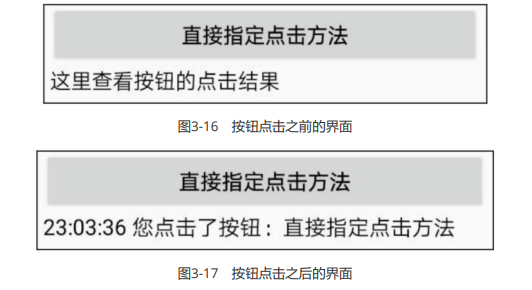
比较图3-16和图3-17的文字差异,可见点击按钮之后确实调用了doClick方法。
点击事件和长按事件
虽然按钮控件能够在XML文件中通过onClick属性指定点击方法,但是方法的名称可以随便叫,既能叫 doClick也能叫doTouch,甚至叫它doA或doB都没问题,这样很不利于规范化代码,倘若以后换了别人 接手,就不晓得doA或doB是干什么用的。因此在实际开发中,不推荐使用Button标签的onClick属性, 而是在代码中给按钮对象注册点击监听器。
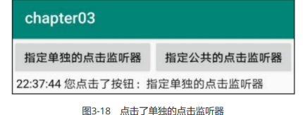
所谓监听器,意思是专门监听控件的动作行为,它平时无所事事,只有控件发生了指定的动作,监听器 才会触发开关去执行对应的代码逻辑。点击监听器需要实现接口View.OnClickListener,并重写onClick 方法补充点击事件的处理代码,再由按钮调用setOnClickListener方法设置监听器对象。比如下面的代 码给按钮控件btn_click_single设置了一个点击监听器:
// 从布局文件中获取名为btn_click_single的按钮控件
Button btn_click_single = findViewById(R.id.btn_click_single);
// 给btn_click_single设置点击监听器,一旦用户点击按钮,就触发监听器的onClick方法
btn_click_single.setOnClickListener(new MyOnClickListener());上面的点击监听器名为MyOnClickListener,它的定义代码示例如下:
// 定义一个点击监听器,它实现了接口View.OnClickListener
class MyOnClickListener implements View.OnClickListener {

     @Override
     public void onClick(View v) { // 点击事件的处理方法
          String desc = String.format("%s 您点击了按钮:%s",
          DateUtil.getNowTime(), ((Button)v).getText());
          tv_result.setText(desc); // 设置文本视图的文本内容
     }

}接着运行App,点击按钮之后的界面如图3-18所示,可见点击动作的确触发了监听器的onClick方法。
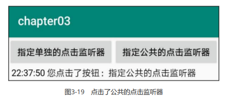
如果一个页面只有一个按钮,单独定义新的监听器倒也无妨,可是如果存在许多按钮,每个按钮都定义 自己的监听器,那就劳民伤财了。对于同时监听多个按钮的情况,更好的办法是注册统一的监听器,也 就是让当前页面实现接口View.OnClickListener,如此一来,onClick方法便写在了页面代码之内。因为 是统一的监听器,所以onClick内部需要判断是哪个按钮被点击了,也就是利用视图对象的getId方法检 查控件编号,完整的onClick代码举例如下:
@Override
public void onClick(View v) { // 点击事件的处理方法

     if (v.getId() == R.id.btn_click_public) { // 来自于按钮btn_click_public
          String desc = String.format("%s 您点击了按钮:%s",
          DateUtil.getNowTime(), ((Button)
          v).getText());
          tv_result.setText(desc); // 设置文本视图的文本内容
     }

}当然该页面的onCreate内部别忘了调用按钮对象的setOnClickListener方法,把按钮的点击监听器设置 成当前页面,设置代码如下所示:
// 从布局文件中获取名为btn_click_public的按钮控件
Button btn_click_public = findViewById(R.id.btn_click_public);
// 设置点击监听器,一旦用户点击按钮,就触发监听器的onClick方法
btn_click_public.setOnClickListener(this);重新运行App,点击第二个按钮之后的界面如图3-19所示,可见当前页面的onClick方法也正确执行了。
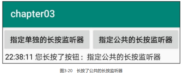
除了点击事件,Android还设计了另外一种长按事件,每当控件被按住超过500毫秒之后,就会触发该控 件的长按事件。若要捕捉按钮的长按事件,可调用按钮对象的setOnLongClickListener方法设置长按监 听器。具体的设置代码示例如下:
// 从布局文件中获取名为btn_click_public的按钮控件
Button btn_longclick_public = findViewById(R.id.btn_longclick_public);
// 设置长按监听器,一旦用户长按按钮,就触发监听器的onLongClick方法
btn_longclick_public.setOnLongClickListener(this);以上代码把长按监听器设置到当前页面,意味着该页面需要实现对应的长按接口 View.OnLongClickListener,并重写长按方法onLongClick,下面便是重写后的onLongClick代码例子:
@Override
public boolean onLongClick(View v) { // 长按事件的处理方法

     if (v.getId() == R.id.btn_longclick_public) { // 来自于按钮
          btn_longclick_public
          String desc = String.format("%s 您长按了按钮:%s",
          DateUtil.getNowTime(), ((Button)
          v).getText());
          tv_result.setText(desc); // 设置文本视图的文本内容
     }
     return true;

}再次运行App,长按按钮之后的界面如图3-20所示,说明长按事件果然触发了onLongClick方法。
值得注意的是,点击监听器和长按监听器不局限于按钮控件,其实它们都来源于视图基类View,凡是从 View派生而来的各类控件,均可注册点击监听器和长按监听器。譬如文本视图TextView,其对象也能调 用setOnClickListener方法与setOnLongClickListener方法,此时TextView控件就会响应点击动作和长 按动作。因为按钮存在按下和松开两种背景,便于提示用户该控件允许点击,但文本视图默认没有按压 背景,不方便判断是否被点击,所以一般不会让文本视图处理点击事件和长按事件。
禁用与恢复按钮
尽管按钮控件生来就是给人点击的,可是某些情况希望暂时禁止点击操作,譬如用户在注册的时候,有 的网站要求用户必须同意指定条款,而且至少浏览10秒之后才能点击注册按钮。那么在10秒之前,注册 按钮应当置灰且不能点击,等过了10秒之后,注册按钮才恢复正常。在这样的业务场景中,按钮先后拥 有两种状态,即不可用状态与可用状态,它们在外观和功能上的区别如下:
- 不可用按钮:按钮不允许点击,即使点击也没反应,同时按钮文字为灰色。
- 可用按钮:按钮允许点击,点击按钮会触发点击事件,同时按钮文字为正常的黑色。
从上述的区别说明可知,不可用与可用状态主要有两点差异:其一,是否允许点击;其二,按钮文字的 颜色。就文字颜色而言,可在布局文件中使用textColor属性设置颜色,也可在Java代码中调用 setTextColor方法设置颜色。至于是否允许点击,则需引入新属性android:enabled,该属性值为true时 表示启用按钮,即允许点击按钮;该属性值为false时表示禁用按钮,即不允许点击按钮。在Java代码 中,则可通过setEnabled方法设置按钮的可用状态(true表示启用,false表示禁用)。
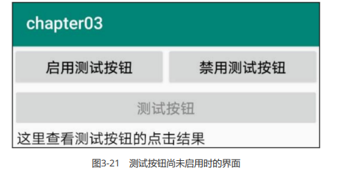
接下来通过一个例子演示按钮的启用和禁用操作。为了改变测试按钮的可用状态,需要额外添加两个控 制按钮,分别是“启用测试按钮”和“禁用测试按钮”,加起来一共3个按钮控件,注意“测试按钮”默认是灰 色文本。测试界面的布局效果如图3-21所示。
与图3-21对应的布局文件内容如下所示:
<LinearLayout xmlns:android="http://schemas.android.com/apk/res/android"
     android:layout_width="match_parent"
     android:layout_height="match_parent"
     android:orientation="vertical">

     <LinearLayout
          android:layout_width="match_parent"
          android:layout_height="wrap_content"
          android:orientation="horizontal">

     	<Button
               android:id="@+id/btn_enable"
               android:layout_width="0dp"
               android:layout_height="wrap_content"
               android:layout_weight="1"
               android:text="启用测试按钮"
               android:textColor="#000000"
               android:textSize="17sp" />

          <Button
               android:id="@+id/btn_disable"
               android:layout_width="0dp"
               android:layout_height="wrap_content"
               android:layout_weight="1"
               android:text="禁用测试按钮"
               android:textColor="#000000"
               android:textSize="17sp" />

	</LinearLayout>

     <Button
          android:id="@+id/btn_test"
          android:layout_width="match_parent"
          android:layout_height="wrap_content"
          android:enabled="false"
          android:text="测试按钮"
          android:textColor="#888888"
          android:textSize="17sp" />

     <TextView
          android:id="@+id/tv_result"
          android:layout_width="match_parent"
          android:layout_height="wrap_content"
          android:paddingLeft="5dp"
          android:text="这里查看测试按钮的点击结果"
          android:textColor="#000000"
          android:textSize="17sp" />

</LinearLayout>然后在Java代码中给3个按钮分别注册点击监听器,注册代码如下所示:
// 因为按钮控件的setOnClickListener方法来源于View基类,所以也可对findViewById得到的视图直接设置点击监听器
findViewById(R.id.btn_enable).setOnClickListener(this);
findViewById(R.id.btn_disable).setOnClickListener(this);
btn_test = findViewById(R.id.btn_test); // 获取名叫btn_test的按钮控件
btn_test.setOnClickListener(this); // 设置btn_test的点击监听器同时重写页面的onClick方法,分别处理3个按钮的点击事件,修改之后的onClick代码示例如下:
@Override
public void onClick(View v) { // 点击事件的处理方法

     // 由于多个控件都把点击监听器设置到了当前页面,因此公共的onClick方法内部需要区分来自于哪个按钮
     if (v.getId() == R.id.btn_enable) { // 点击了按钮“启用测试按钮”

          btn_test.setTextColor(Color.BLACK); // 设置按钮的文字颜色
          btn_test.setEnabled(true); // 启用当前控件
          } else if (v.getId() == R.id.btn_disable) { // 点击了按钮“禁用测试按钮”
          btn_test.setTextColor(Color.GRAY); // 设置按钮的文字颜色
          btn_test.setEnabled(false); // 禁用当前控件
          } else if (v.getId() == R.id.btn_test) { // 点击了按钮“测试按钮”
          String desc = String.format("%s 您点击了按钮:%s",
          DateUtil.getNowTime(), ((Button)
          v).getText());
          tv_result.setText(desc); // 设置文本视图的文本内容

     }

}最后编译运行App,点击了“启用测试按钮”之后,原本置灰的测试按钮btn_test恢复正常的黑色文本,点 击该按钮发现界面有了反应,具体效果如图3-22所示。
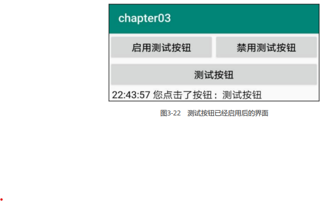
对比图3-21和图3-22,观察按钮启用前后的外观及其是否响应点击动作,即可知晓禁用按钮和启用按钮 两种模式的差别。
图像显示
图像显示有关的几种控件用法,包括:专门用于显示图片的图像视图以及若干缩放类型效 果,支持显示图片的按钮控件——图像按钮,如何在按钮控件上同时显示文本和图标等。
图像视图ImageView
显示文本用到了文本视图TextView,显示图像则用到图像视图ImageView。由于图像通常保存为单独的 图片文件,因此需要先把图片放到res/drawable目录,然后再去引用该图片的资源名称。比如现在有张 苹果图片名为apple.png,那么XML文件通过属性android:src设置图片资源,属性值格式形如 “@drawable/不含扩展名的图片名称”。添加了src属性的ImageView标签示例如下:
<ImageView
     android:id="@+id/iv_scale"
     android:layout_width="match_parent"
     android:layout_height="220dp"
android:src="@drawable/apple" />若想在Java代码中设置图像视图的图片资源,可调用ImageView控件的setImageResource方法,方法参 数格式形如“R.drawable.不含扩展名的图片名称”。仍以上述的苹果图片为例,给图像视图设置图片资源 的代码例子如下所示:
// 从布局文件中获取名为iv_scale的图像视图
ImageView iv_scale = findViewById(R.id.iv_scale);
iv_scale.setImageResource(R.drawable.apple); // 设置图像视图的图片资源运行测试App,展示图片的界面效果如图3-23所示。
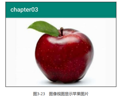
观察效果图发现苹果图片居中显示,而非文本视图里的文字那样默认靠左显示,这是怎么回事?原来 ImageView本身默认图片居中显示,不管图片有多大抑或有多小,图像视图都会自动缩放图片,使之刚 好够着ImageView的边界,并且缩放后的图片保持原始的宽高比例,看起来图片很完美地占据视图中 央。这种缩放类型在XML文件中通过属性android:scaleType定义,即使图像视图未明确指定该属性,系统也会默认其值为fitCenter,表示让图像缩放后居中显示。添加了缩放属性的ImageView标签如下所 示:
<ImageView
     android:id="@+id/iv_scale"
     android:layout_width="match_parent"
     android:layout_height="220dp"
     android:src="@drawable/apple"
android:scaleType="fitCenter"/>在Java代码中可调用setScaleType方法设置图像视图的缩放类型,其中fitCenter对应的类型为 ScaleType.FIT_CENTER,设置代码示例如下:
// 将缩放类型设置为“保持宽高比例,缩放图片使其位于视图中间”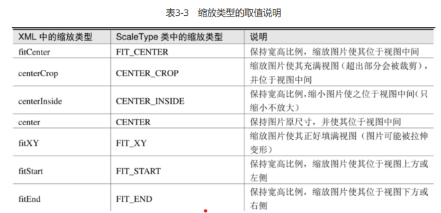
iv_scale.setScaleType(ImageView.ScaleType.FIT_CENTER);除了居中显示,图像视图还提供了其他缩放类型,详细的缩放类型取值说明见表3-3。
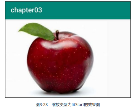
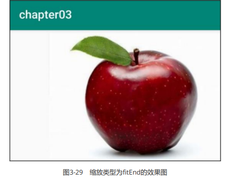
注意居中显示fitCenter是默认的缩放类型,它的图像效果如之前的图3-23所示。其余缩放类型的图像显 示效果分别如图3-24到图3-29所示,其中图3-24为centerCrop的效果图,图3-25为centerInside的效果 图,图3-26为center的效果图,图3-27为fitXY的效果图,图3-28为fitStart的效果图,图3-29为fitEnd的效果图。
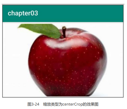
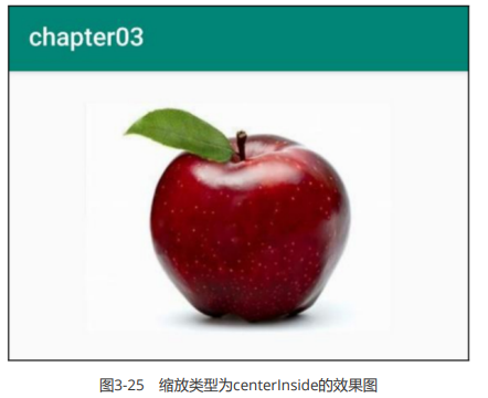
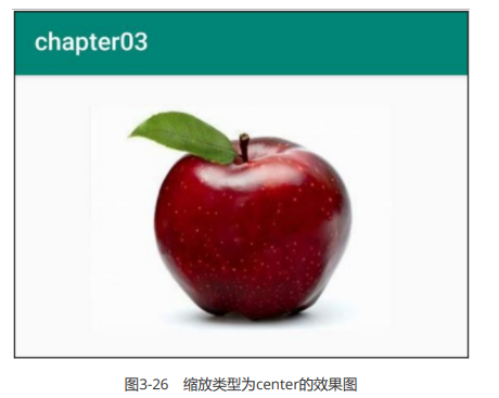
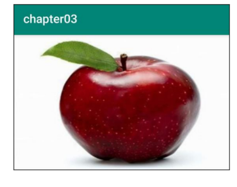
图3-27 缩放类型为fitXY的效果图
注意到centerInside和center的显示效果居然一模一样,这缘于它们的缩放规则设定。表面上 fitCenter、centerInside、center三个类型都是居中显示,且均不越过图像视图的边界。它们之间的区 别在于:fitCenter既允许缩小图片、也允许放大图片,centerInside只允许缩小图片、不允许放大图 标,而center自始至终保持原始尺寸(既不允许缩小图片、也不允许放大图片)。因此,当图片尺寸大 于视图宽高,centerInside与fitCenter都会缩小图片,此时它俩的显示效果相同;当图片尺寸小于视图 宽高,centerInside与center都保持图片大小不变,此时它俩的显示效果相同。
图像按钮ImageButton
常见的按钮控件Button其实是文本按钮,因为按钮上面只能显示文字,不能显示图片,ImageButton才 是显示图片的图像按钮。虽然ImageButton号称图像按钮,但它并非继承Button,而是继承了 ImageView,所以凡是ImageView拥有的属性和方法,ImageButton统统拿了过来,区别在于 ImageButton有个按钮背景。
尽管ImageButton源自ImageView,但它毕竟是个按钮呀,按钮家族常用的点击事件和长按事件, ImageButton全都没落下。不过ImageButton和Button之间除了名称不同,还有下列差异:
- Button既可显示文本也可显示图片(通过setBackgroundResource方法设置背景图片),而 ImageButton只能显示图片不能显示文本。
- ImageButton上的图像可按比例缩放,而Button通过背景设置的图像会拉伸变形,因为背景图采取 fitXY 方式,无法按比例缩放。
- Button只能靠背景显示一张图片,而ImageButton可分别在前景和背景显示图片,从而实现两张图片叠加的效果。
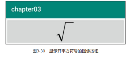
从上面可以看出,Button与ImageButton各有千秋,通常情况使用Button就够用了。但在某些场合,比 如输入法打不出来的字符,以及特殊字体显示的字符串,就适合先切图再放到ImageButton。举个例 子,数学常见的开平方运算,由输入法打出来的运算符号为“√”,但该符号缺少右上角的一横,正确的开 平方符号是带横线的,此时便需要通过ImageButton显示这个开方图片。
不过使用ImageButton得注意,图像按钮默认的缩放类型为center(保持原始尺寸不缩放图片),而非 图像视图默认的fitCenter,倘若图片尺寸较大,那么图像按钮将无法显示整个图片。为避免显示不完整 的情况,XML文件中的ImageButton标签必须指定fitCenter的缩放类型,详细的标签内容示例如下:
<ImageButton
     android:layout_width="match_parent"
     android:layout_height="80dp"
     android:src="@drawable/sqrt"
android:scaleType="fitCenter" />运行测试App,打开演示界面如图3-30所示,可见图像按钮正确展示了开平方符号。
同时展示文本与图像
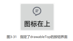
现在有了Button可在按钮上显示文字,又有ImageButton可在按钮上显示图像,照理说绝大多数场合都 够用了。然而现实项目中的需求往往捉摸不定,例如客户要求在按钮文字的左边加一个图标,这样按钮 内部既有文字又有图片,乍看之下Button和ImageButton都没法直接使用。若用LinearLayout对 ImageView和TextView组合布局,虽然可行,XML文件却变得冗长许多。
其实有个既简单又灵活的办法,要想在文字周围放置图片,使用按钮控件Button就能实现。原来Button 悄悄提供了几个与图标有关的属性,通过这些属性即可指定文字旁边的图标,以下是有关的图标属性说 明。
- drawableTop:指定文字上方的图片。
- drawableBottom:指定文字下方的图片。
- drawableLeft:指定文字左边的图片。
- drawableRight:指定文字右边的图片。
- drawablePadding:指定图片与文字的间距。
譬如下面是个既有文字又有图标的Button标签例子:
<Button
android:layout_width="wrap_content"
android:layout_height="wrap_content"
android:drawableLeft="@drawable/ic_about"
android:drawablePadding="5dp"
android:text="图标在左"
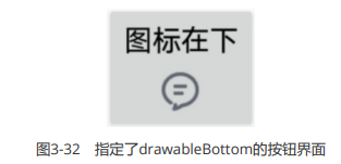
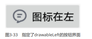
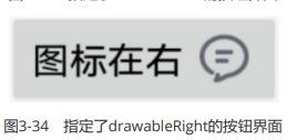
android:textSize="17sp" />以上的Button标签通过属性android:drawableTop设置了文字上边的图标,若想变更图标所处的位置, 只要把drawableTop换成对应方向的属性即可。各方向的图文混排按钮效果分别如图3-31到图3-34所 示,其中图3-31为指定了drawableTop的按钮界面,图3-32为指定了drawableBottom的按钮界面,图 3-33为指定了drawableLeft的按钮界面,图3-34为指定了drawableRight的按钮界面。
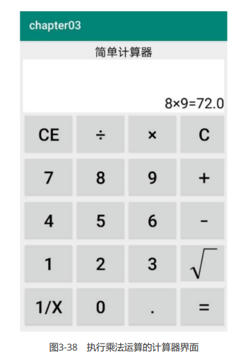
计算器代码
string.xml
<resources>
    <!-- 计算器 -->
    <string name="simple_calculator">简易计算器</string>
    <string name="cancel">CE</string>
    <string name="divide">÷</string>
    <string name="multiply">×</string>
    <string name="clear">C</string>
    <string name="seven">7</string>
    <string name="eight">8</string>
    <string name="night">9</string>
    <string name="add">+</string>
    <string name="four">4</string>
    <string name="five">5</string>
    <string name="six">6</string>
    <string name="minus">-</string>
    <string name="one">1</string>
    <string name="two">2</string>
    <string name="three">3</string>
    <string name="sqrt">√</string>
    <string name="reciprocal">1/x</string>
    <string name="zero">0</string>
    <string name="drop">.</string>
    <string name="equal">=</string>
</resources>dimens.xml
<?xml version="1.0" encoding="utf-8"?>
<resources>
    <dimen name="btn_font_size">20sp</dimen>
    <dimen name="btn_height">75dp</dimen>
</resources>xml布局
<?xml version="1.0" encoding="utf-8"?>
<LinearLayout xmlns:android="http://schemas.android.com/apk/res/android"
    android:layout_width="match_parent"
    android:layout_height="match_parent"
    android:background="#EEEE"
    android:padding="5dp">

    <ScrollView
        android:layout_width="match_parent"
        android:layout_height="wrap_content">

        <LinearLayout
            android:layout_width="match_parent"
            android:layout_height="wrap_content"
            android:orientation="vertical">

            <TextView
                android:layout_width="match_parent"
                android:layout_height="wrap_content"
                android:gravity="center"
                android:text="@string/simple_calculator"
                android:textColor="#000000"
                android:textSize="20sp" />

            <TextView
                android:id="@+id/tv_result"
                android:layout_width="match_parent"
                android:layout_height="wrap_content"
                android:background="@color/white"
                android:gravity="right|bottom"
                android:lines="3"
                android:text="0"
                android:textSize="25sp" />

            <GridLayout
                android:layout_width="match_parent"
                android:layout_height="wrap_content"
                android:columnCount="4"
                android:rowCount="5">

                <Button
                    android:id="@+id/btn_cancel"
                    android:layout_width="0dp"
                    android:layout_height="@dimen/btn_height"
                    android:layout_columnWeight="1"
                    android:background="#EEEEEE"
                    android:gravity="center"
                    android:text="@string/cancel"
                    android:textColor="@color/black"
                    android:textSize="@dimen/btn_font_size" />

                <Button
                    android:id="@+id/btn_divide"
                    android:layout_width="0dp"
                    android:layout_height="@dimen/btn_height"
                    android:layout_columnWeight="1"
                    android:background="#EEEEEE"
                    android:gravity="center"
                    android:text="@string/divide"
                    android:textColor="@color/black"
                    android:textSize="@dimen/btn_font_size" />

                <Button
                    android:id="@+id/btn_multiply"
                    android:layout_width="0dp"
                    android:layout_height="@dimen/btn_height"
                    android:layout_columnWeight="1"
                    android:background="#EEEEEE"
                    android:gravity="center"
                    android:text="@string/multiply"
                    android:textColor="@color/black"
                    android:textSize="@dimen/btn_font_size" />

                <Button
                    android:id="@+id/btn_clear"
                    android:layout_width="0dp"
                    android:layout_height="@dimen/btn_height"
                    android:layout_columnWeight="1"
                    android:background="#EEEEEE"
                    android:gravity="center"
                    android:text="@string/clear"
                    android:textColor="@color/black"
                    android:textSize="@dimen/btn_font_size" />

                <Button
                    android:id="@+id/btn_seven"
                    android:layout_width="0dp"
                    android:layout_height="@dimen/btn_height"
                    android:layout_columnWeight="1"
                    android:background="#EEEEEE"
                    android:gravity="center"
                    android:text="@string/seven"
                    android:textColor="@color/black"
                    android:textSize="@dimen/btn_font_size" />

                <Button
                    android:id="@+id/btn_eight"
                    android:layout_width="0dp"
                    android:layout_height="@dimen/btn_height"
                    android:layout_columnWeight="1"
                    android:background="#EEEEEE"
                    android:gravity="center"
                    android:text="@string/eight"
                    android:textColor="@color/black"
                    android:textSize="@dimen/btn_font_size" />

                <Button
                    android:id="@+id/btn_night"
                    android:layout_width="0dp"
                    android:layout_height="@dimen/btn_height"
                    android:layout_columnWeight="1"
                    android:background="#EEEEEE"
                    android:gravity="center"
                    android:text="@string/night"
                    android:textColor="@color/black"
                    android:textSize="@dimen/btn_font_size" />

                <Button
                    android:id="@+id/btn_add"
                    android:layout_width="0dp"
                    android:layout_height="@dimen/btn_height"
                    android:layout_columnWeight="1"
                    android:background="#EEEEEE"
                    android:gravity="center"
                    android:text="@string/add"
                    android:textColor="@color/black"
                    android:textSize="@dimen/btn_font_size" />

                <Button
                    android:id="@+id/btn_four"
                    android:layout_width="0dp"
                    android:layout_height="@dimen/btn_height"
                    android:layout_columnWeight="1"
                    android:background="#EEEEEE"
                    android:gravity="center"
                    android:text="@string/four"
                    android:textColor="@color/black"
                    android:textSize="@dimen/btn_font_size" />

                <Button
                    android:id="@+id/btn_five"
                    android:layout_width="0dp"
                    android:layout_height="@dimen/btn_height"
                    android:layout_columnWeight="1"
                    android:background="#EEEEEE"
                    android:gravity="center"
                    android:text="@string/five"
                    android:textColor="@color/black"
                    android:textSize="@dimen/btn_font_size" />

                <Button
                    android:id="@+id/btn_six"
                    android:layout_width="0dp"
                    android:layout_height="@dimen/btn_height"
                    android:layout_columnWeight="1"
                    android:background="#EEEEEE"
                    android:gravity="center"
                    android:text="@string/six"
                    android:textColor="@color/black"
                    android:textSize="@dimen/btn_font_size" />

                <Button
                    android:id="@+id/btn_minus"
                    android:layout_width="0dp"
                    android:layout_height="@dimen/btn_height"
                    android:layout_columnWeight="1"
                    android:background="#EEEEEE"
                    android:gravity="center"
                    android:text="@string/minus"
                    android:textColor="@color/black"
                    android:textSize="@dimen/btn_font_size" />

                <Button
                    android:id="@+id/btn_one"
                    android:layout_width="0dp"
                    android:layout_height="@dimen/btn_height"
                    android:layout_columnWeight="1"
                    android:background="#EEEEEE"
                    android:gravity="center"
                    android:text="@string/one"
                    android:textColor="@color/black"
                    android:textSize="@dimen/btn_font_size" />

                <Button
                    android:id="@+id/btn_two"
                    android:layout_width="0dp"
                    android:layout_height="@dimen/btn_height"
                    android:layout_columnWeight="1"
                    android:background="#EEEEEE"
                    android:gravity="center"
                    android:text="@string/two"
                    android:textColor="@color/black"
                    android:textSize="@dimen/btn_font_size" />

                <Button
                    android:id="@+id/btn_three"
                    android:layout_width="0dp"
                    android:layout_height="@dimen/btn_height"
                    android:layout_columnWeight="1"
                    android:background="#EEEEEE"
                    android:gravity="center"
                    android:text="@string/three"
                    android:textColor="@color/black"
                    android:textSize="@dimen/btn_font_size" />

                <Button
                    android:id="@+id/btn_sqrt"
                    android:layout_width="0dp"
                    android:layout_height="@dimen/btn_height"
                    android:layout_columnWeight="1"
                    android:background="#EEEEEE"
                    android:gravity="center"
                    android:text="@string/sqrt"
                    android:textColor="@color/black"
                    android:textSize="@dimen/btn_font_size" />

                <Button
                    android:id="@+id/btn_reciprocal"
                    android:layout_width="0dp"
                    android:layout_height="@dimen/btn_height"
                    android:layout_columnWeight="1"
                    android:background="#EEEEEE"
                    android:gravity="center"
                    android:text="@string/reciprocal"
                    android:textColor="@color/black"
                    android:textSize="@dimen/btn_font_size" />

                <Button
                    android:id="@+id/btn_zero"
                    android:layout_width="0dp"
                    android:layout_height="@dimen/btn_height"
                    android:layout_columnWeight="1"
                    android:background="#EEEEEE"
                    android:gravity="center"
                    android:text="@string/zero"
                    android:textColor="@color/black"
                    android:textSize="@dimen/btn_font_size" />

                <Button
                    android:id="@+id/btn_drop"
                    android:layout_width="0dp"
                    android:layout_height="@dimen/btn_height"
                    android:layout_columnWeight="1"
                    android:background="#EEEEEE"
                    android:gravity="center"
                    android:text="@string/drop"
                    android:textColor="@color/black"
                    android:textSize="@dimen/btn_font_size" />

                <Button
                    android:id="@+id/btn_equal"
                    android:layout_width="0dp"
                    android:layout_height="@dimen/btn_height"
                    android:layout_columnWeight="1"
                    android:background="#EEEEEE"
                    android:gravity="center"
                    android:text="@string/equal"
                    android:textColor="@color/black"
                    android:textSize="@dimen/btn_font_size" />
            </GridLayout>

        </LinearLayout>

    </ScrollView>

</LinearLayout>java
package com.example.chapter03;
import androidx.appcompat.app.AppCompatActivity;
import android.os.Bundle;
import android.util.Log;
import android.view.View;
import android.widget.TextView;
import java.util.Arrays;
import java.util.HashSet;
public class CalculatorActivity extends AppCompatActivity implements View.OnClickListener {
//输入框
private TextView tv_result;
//第一个数字
private String firstNum = "";
//运算符
private String operator = "";
//第二个数字
private String secondNum = "";
//结果
private String result = "";
//显示文本内容
private String showText = "";
@Override
protected void onCreate(Bundle savedInstanceState) {
super.onCreate(savedInstanceState);
setContentView(R.layout.activity_calculator);
tv_result = findViewById(R.id.tv_result);
findViewById(R.id.btn_cancel).setOnClickListener(this);//回退按钮
findViewById(R.id.btn_divide).setOnClickListener(this);//除法按钮
findViewById(R.id.btn_multiply).setOnClickListener(this);//乘法按钮
findViewById(R.id.btn_clear).setOnClickListener(this);//清除按钮
findViewById(R.id.btn_seven).setOnClickListener(this);//7
findViewById(R.id.btn_eight).setOnClickListener(this);//8
findViewById(R.id.btn_night).setOnClickListener(this);//9
findViewById(R.id.btn_add).setOnClickListener(this);//加法按钮
findViewById(R.id.btn_four).setOnClickListener(this);//4
findViewById(R.id.btn_five).setOnClickListener(this);//5
findViewById(R.id.btn_six).setOnClickListener(this);//6
findViewById(R.id.btn_minus).setOnClickListener(this);//减法按钮
findViewById(R.id.btn_one).setOnClickListener(this);//1
findViewById(R.id.btn_two).setOnClickListener(this);//2
findViewById(R.id.btn_three).setOnClickListener(this);//3
findViewById(R.id.btn_sqrt).setOnClickListener(this);//开根号按钮
findViewById(R.id.btn_reciprocal).setOnClickListener(this);//求导数按钮
findViewById(R.id.btn_zero).setOnClickListener(this);//0
findViewById(R.id.btn_drop).setOnClickListener(this);//小数点按钮
findViewById(R.id.btn_equal).setOnClickListener(this);//等号按钮
}
@Override
public void onClick(View view) {
String inputText = ((TextView)view).getText().toString();
//点击了回退按钮
if (R.id.btn_cancel == view.getId()){
if (!(firstNum.equals("")) && secondNum.equals("")){
clear();
}
else if (!(secondNum.equals("")) && !(firstNum.equals(""))){
refreshText(firstNum+operator);
secondNum = "";
}
else {
clear();
}
}
//点击了清除按钮
else if (R.id.btn_clear == view.getId()){
clear();
}
//点击了加减乘除按钮
else if (R.id.btn_add == view.getId() || R.id.btn_minus == view.getId() ||
R.id.btn_multiply == view.getId() || R.id.btn_divide == view.getId() ) {
operator = inputText;
refreshText(showText+operator);
}
//点击了开根号按钮
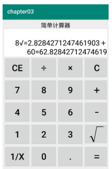
else if (R.id.btn_sqrt == view.getId()) {
double sqrt_result = Math.sqrt(Double.parseDouble(firstNum));
refreshOperate(String.valueOf(sqrt_result));
refreshText(showText + "√="+result);
}
//点击了倒数按钮
else if (R.id.btn_reciprocal == view.getId()) {
double reciprocal_result = 1.0 / Double.parseDouble(firstNum);
refreshOperate(String.valueOf(reciprocal_result));
refreshText(showText + "/="+result);
}
//点击了等号按钮
else if (R.id.btn_equal == view.getId()) {
//加减乘除四则运算
double calculate_result = calculateFour();
refreshOperate(String.valueOf(calculate_result));
refreshText(showText + "="+result);
}
//点击了数字、小数点
else{
//上次结果已经出来了,再点去点数字时候清空上次
if (result.length() > 0 && operator.equals("")){
clear();
}
//运算符为空的情况下,拼接第一个操作数
if (operator.equals("")){
firstNum = firstNum + inputText;
}else{
//如果有运算符,拼接第二个操作数
secondNum = secondNum + inputText;
}
//整数前面为0的时候
if (showText.equals("0") && !inputText.equals(".")){
refreshText(inputText);
}else{
refreshText(showText+inputText);
}
}
}
//加减乘除四则运算,并返回结果
private double calculateFour() {
switch (operator){
case "+":
return Double.parseDouble(firstNum) + Double.parseDouble(secondNum);
case "-":
return Double.parseDouble(firstNum) - Double.parseDouble(secondNum);
case "*":
return Double.parseDouble(firstNum) * Double.parseDouble(secondNum);
default:
return Double.parseDouble(firstNum) / Double.parseDouble(secondNum);
}
}
//刷新文本显示
private void refreshText(String text){
showText = text;
tv_result.setText(showText);
}
//清除,并初始化
private void clear(){
refreshText("");
refreshOperate("");
}
//刷新并返回结果
private void refreshOperate(String new_result){
result = new_result;
firstNum = result;
operator = "";
secondNum = "";
}
}运行效果图