7. 小程序的宿主环境 - 组件
7.1 小程序中组件的分类
小程序中的组件也是由宿主环境提供的,开发者可以基于组件快速搭建出漂亮的页面结构。官方把小程序的组件分为了 9 大类,分别是:
①视图容器
②基础内容
③表单组件
④导航组件
⑤媒体组件
⑥map 地图组件
⑦canvas 画布组件
⑧开放能力
⑨无障碍访问
7.2 常用的视图容器类组件
①view
普通视图区域
类似于 HTML 中的 div,是一个块级元素
常用来实现页面的布局效果
②scroll-view
可滚动的视图区域
常用来实现滚动列表效果
③swiper 和 swiper-item
轮播图容器组件 和 轮播图 item 组件
7.3 view 组件的基本使用
实现如图的 flex 横向布局效果:
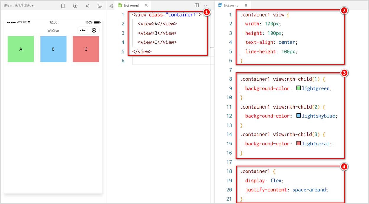
代码:如下
<view class="container">
  <view>A</view>
  <view>B</view>
  <view>C</view>
</view>7.4 scroll-view 组件的基本使用
实现如图的纵向滚动效果:
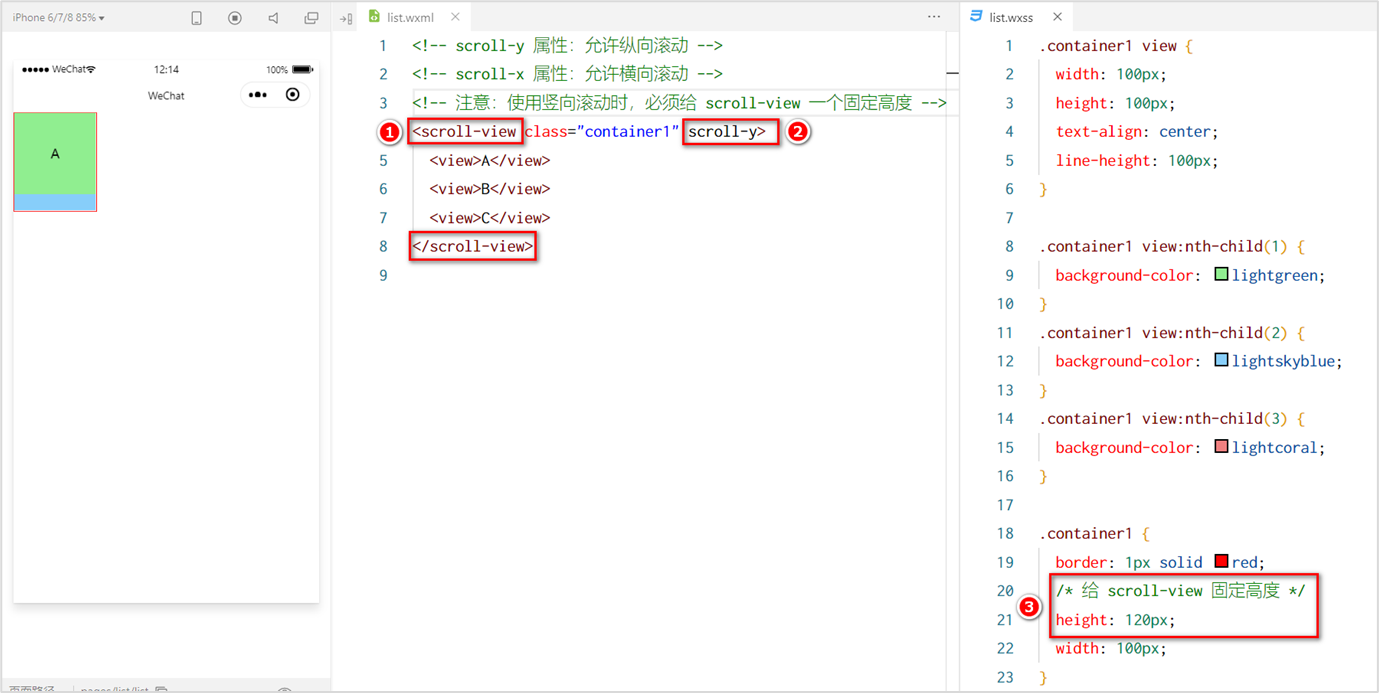
代码:
<!-- scroll-y 属性,允许纵向滚动 -->
<!-- scroll-x 属性,允许横向滚动 -->
<!-- 注意:使用竖向滚动,必须给 scroll-view一个固定的高度 -->
<scroll-view class="container" scroll-y>
  <view>A</view>
  <view>B</view>
  <view>C</view>
</scroll-view>.container view{
width: 150rpx;
height: 150rpx;
text-align: center;
line-height: 150rpx;
}
.container view:nth-child(1){
background-color: aquamarine;
}
.container view:nth-child(2){
background-color: brown;
}
.container view:nth-child(3){
background-color: palevioletred;
}
.container{
display: flex;
justify-content:space-around;
}7.5 swiper 和 swiper-item 组件的基本使用
swiper 和 swiper-item 组件的基本使用
实现如图的轮播图效果:
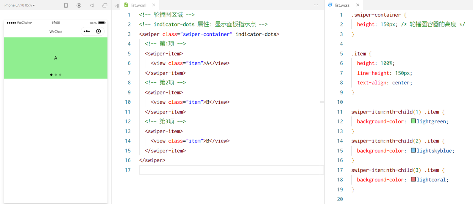
代码:
<!-- 轮播图 -->
<swiper class="swiper-container" indicator-dots indicator-color="skyblue" indicator-active-color="white" autoplay interval="2000" circular>
  <!-- 第一个轮播图 -->
  <swiper-item>
    <view class="item">1</view>
  </swiper-item>

  <!-- 第二个轮播图 -->
  <swiper-item>
    <view class="item">2</view>
  </swiper-item>

  <!-- 第三个轮播图 -->
  <swiper-item>
    <view class="item">3</view>
  </swiper-item>

</swiper>/* 纵向滚动 */
scroll-view{
margin-top: 10px;
display: none;
text-align: center;
border: 1px solid black;
width: 150rpx;
height: 150rpx;
}
/* 轮播图 */
.swiper-container{
height: 200rpx;
margin-top: 10px;
}
.item{
height: 100%;
line-height: 200rpx;
text-align: center;
}
swiper-item:nth-child(1) .item{
background-color: teal;
}
swiper-item:nth-child(2) .item{
background-color: sandybrown;
}
swiper-item:nth-child(3) .item{
background-color: lavender;
}7.6 swiper 组件的常用属性
| 属性 | 类型 | 默认值 | 说明 |
|---|---|---|---|
| indicator-dots | boolean | false | 是否显示面板指示点 |
| indicator-color | color | rgba(0, 0, 0, .3) | 指示点颜色 |
| indicator-active-color | color | #000000 | 当前选中的指示点颜色 |
| autoplay | boolean | false | 是否自动切换 |
| interval | number | 5000 | 自动切换时间间隔 |
| circular | boolean | false | 是否采用衔接滑动 |
| duration | number | 500 | 动画滑动的时间 |
| vertical | boolean | false | 是否纵向滚动 |
7.7 常用的基础内容组件
①text
文本组件
类似于 HTML 中的 span 标签,是一个行内元素
②rich-text
富文本组件
支持把 HTML 字符串渲染为 WXML 结构
7.8 text 组件的基本使用
通过 text 组件的 selectable 属性,实现长按选中文本内容的效果:
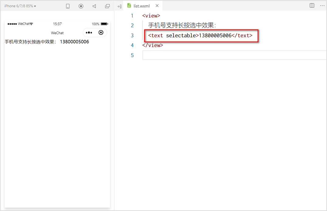
代码:
<!-- text 组件
        使用 selectable 支持长按选中
 -->
<view>
  手机号支持长按选中效果<text selectable>111312323</text>
</view>7.9 rich-text 组件的基本使用
通过 rich-text 组件的 nodes 属性节点,把 HTML 字符串渲染为对应的 UI 结构:
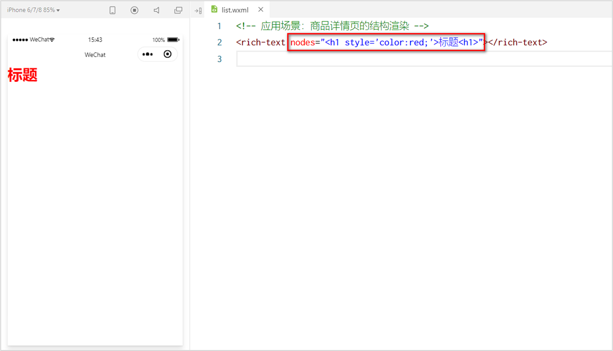
代码:
<!-- rich-text 可以渲染html标签 -->
<rich-text nodes="<h1 style='color:red;'>标题</h1>"></rich-text>7.10 其它常用组件
①button
按钮组件
功能比 HTML 中的 button 按钮丰富
通过 open-type 属性可以调用微信提供的各种功能(客服、转发、获取用户授权、获取用户信息等)
②image
图片组件
image 组件默认宽度约 300px、高度约 240px
③navigator(后面课程会专门讲解)
页面导航组件
类似于 HTML 中的 a 链接
7.11 button 按钮的基本使用
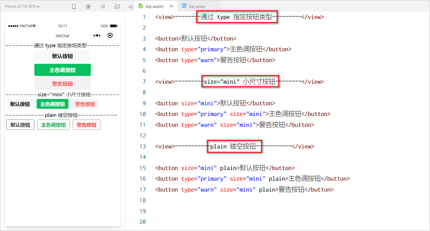
代码:
<!-- button 按钮 -->
<view>
  <!-- 默认 button 按钮(灰色背景) -->
  <button>默认按钮</button>
  <!-- 主色调按钮(绿色背景) -->
  <button type="primary">主色调按钮</button>
  <!-- 警告按钮(字体是红色的) -->
  <button type="warn">警告按钮</button>
  <!-- 小尺寸按钮 -->
  <button size="mini">小尺寸按钮</button>
  <!-- 镂空按钮(背景颜色是白色的,边框线是黑色的) -->
  <button plain>镂空按钮</button>
</view>7.12 image 组件的基本使用
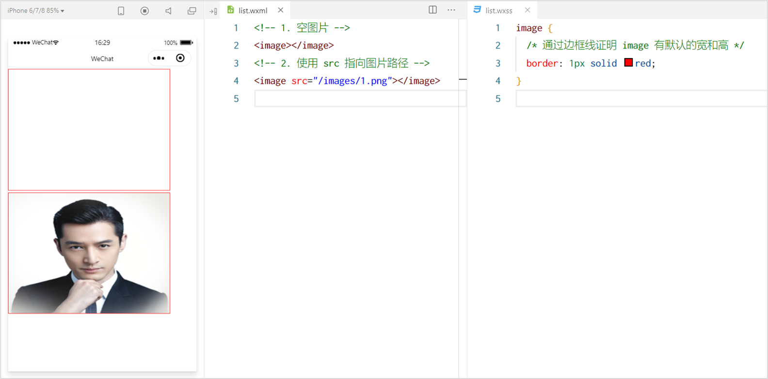
代码:
<!-- image组件 -->
<view>
  <image></image>
  <image src="/pages/images/1.png" mode="heightFix"/>
</view>7.13 image 组件的 mode 属性
image 组件的 mode 属性用来指定图片的裁剪和缩放模式,常用的 mode 属性值如下:
| mode 值 | 说明 |
|---|---|
| scaleToFill | (默认值)缩放模式,不保持纵横比缩放图片,使图片的宽高完全拉伸至填满 image 元素 |
| aspectFit | 缩放模式,保持纵横比缩放图片,使图片的长边能完全显示出来。也就是说,可以完整地将图片显示出来。 |
| aspectFill | 缩放模式,保持纵横比缩放图片,只保证图片的短边能完全显示出来。也就是说,图片通常只在水平或垂直方向是完整的,另一个方向将会发生截取。 |
| widthFix | 缩放模式,宽度不变,高度自动变化,保持原图宽高比不变 |
| heightFix | 缩放模式,高度不变,宽度自动变化,保持原图宽高比不变 |